Objective
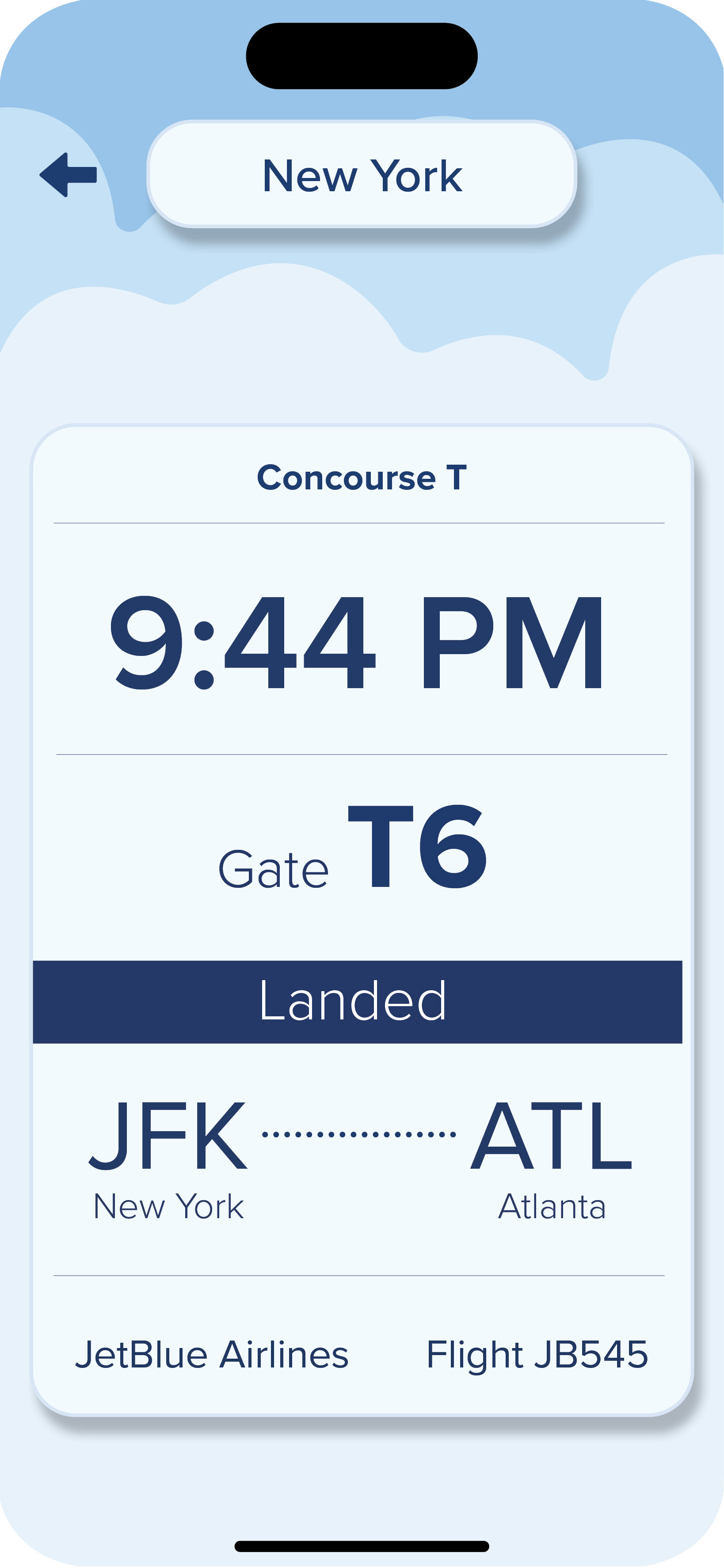
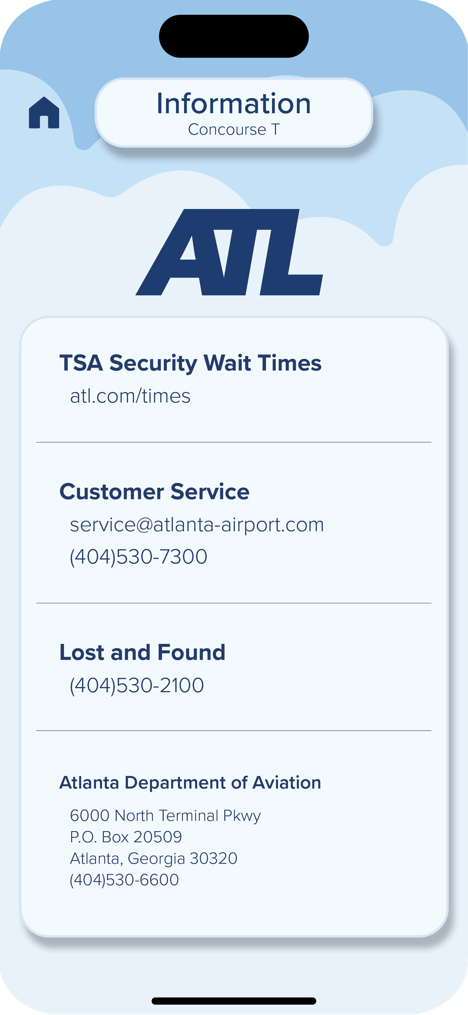
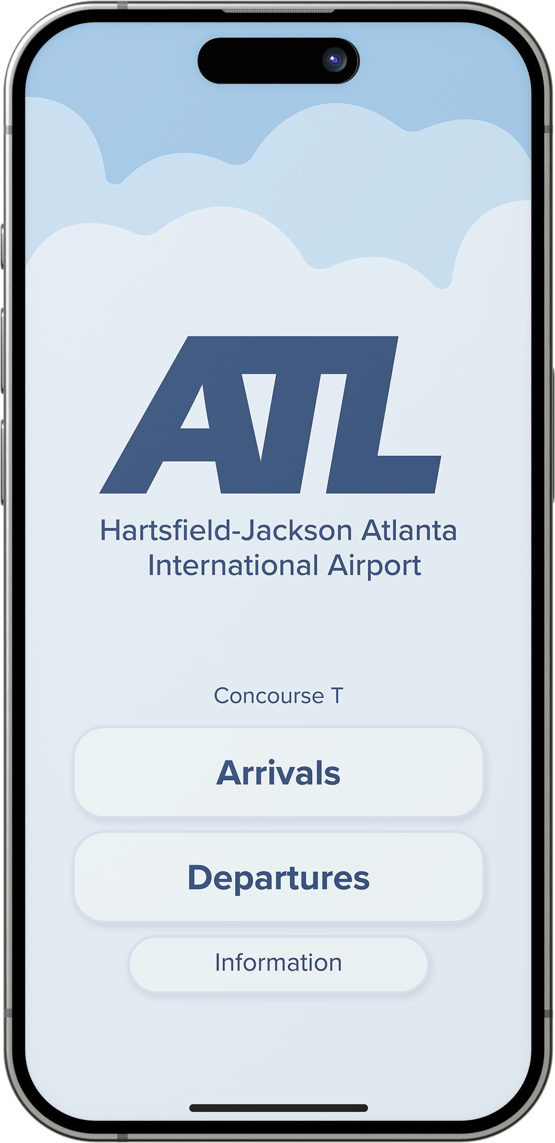
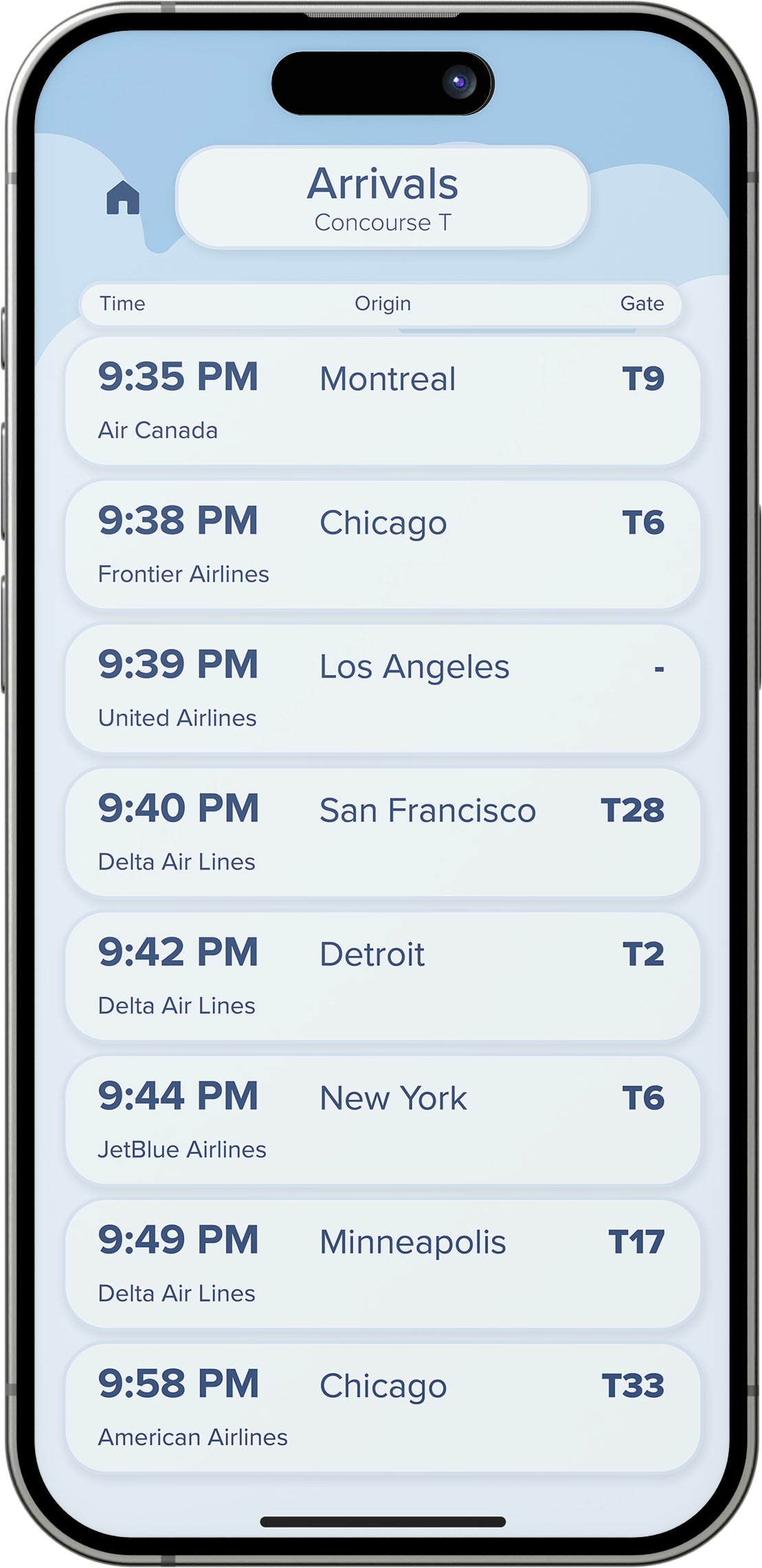
This app interface design utilizes a flight information display system for the Hartsfield-Jackson Atlanta International Airport. The typographic composition makes for easy readability and exploration. The overall goal was for users to have a smooth travel experience and accessibility for those with visual impairments.
Digital Sketches
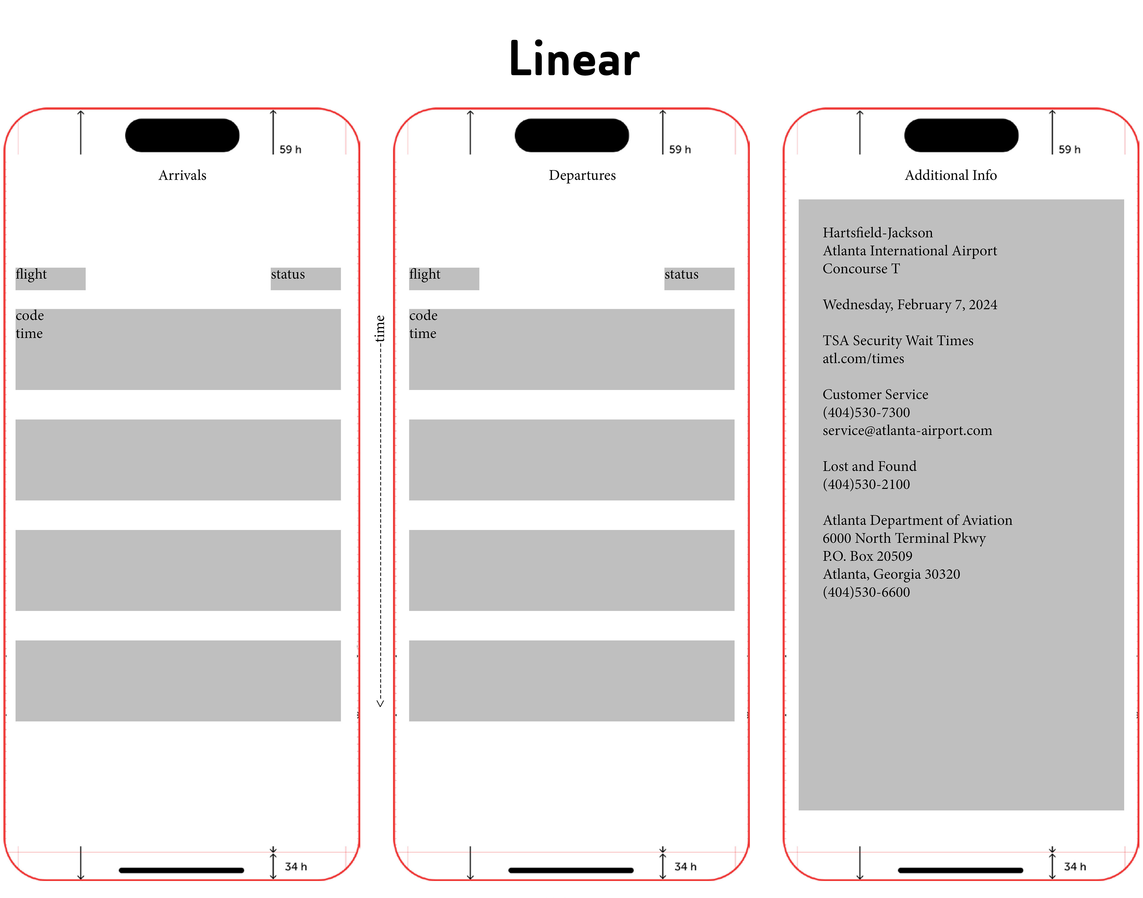
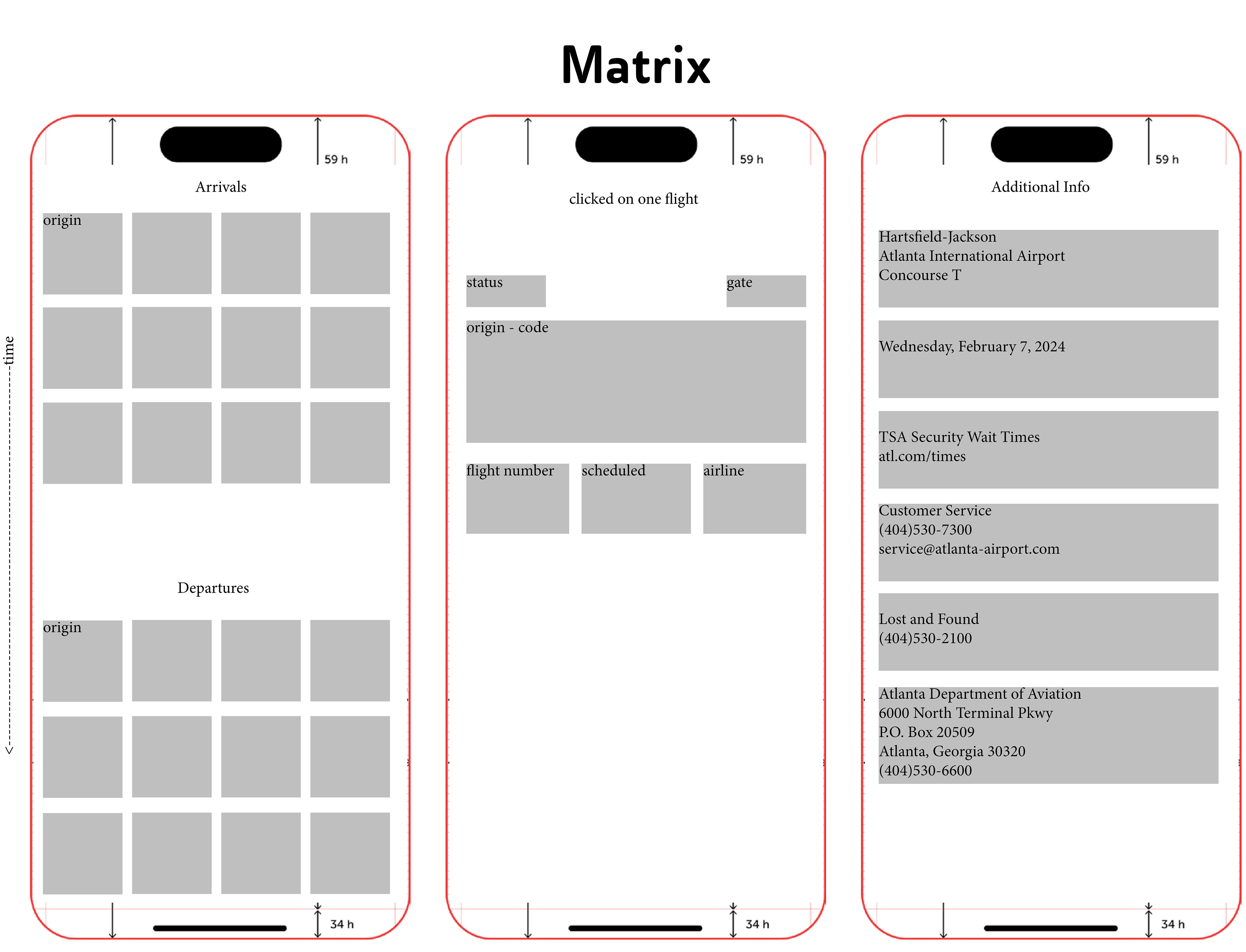
Different organizational systems were experimented upon, and sketches were refined to make information easier to look at. The linear system worked the most efficiently.
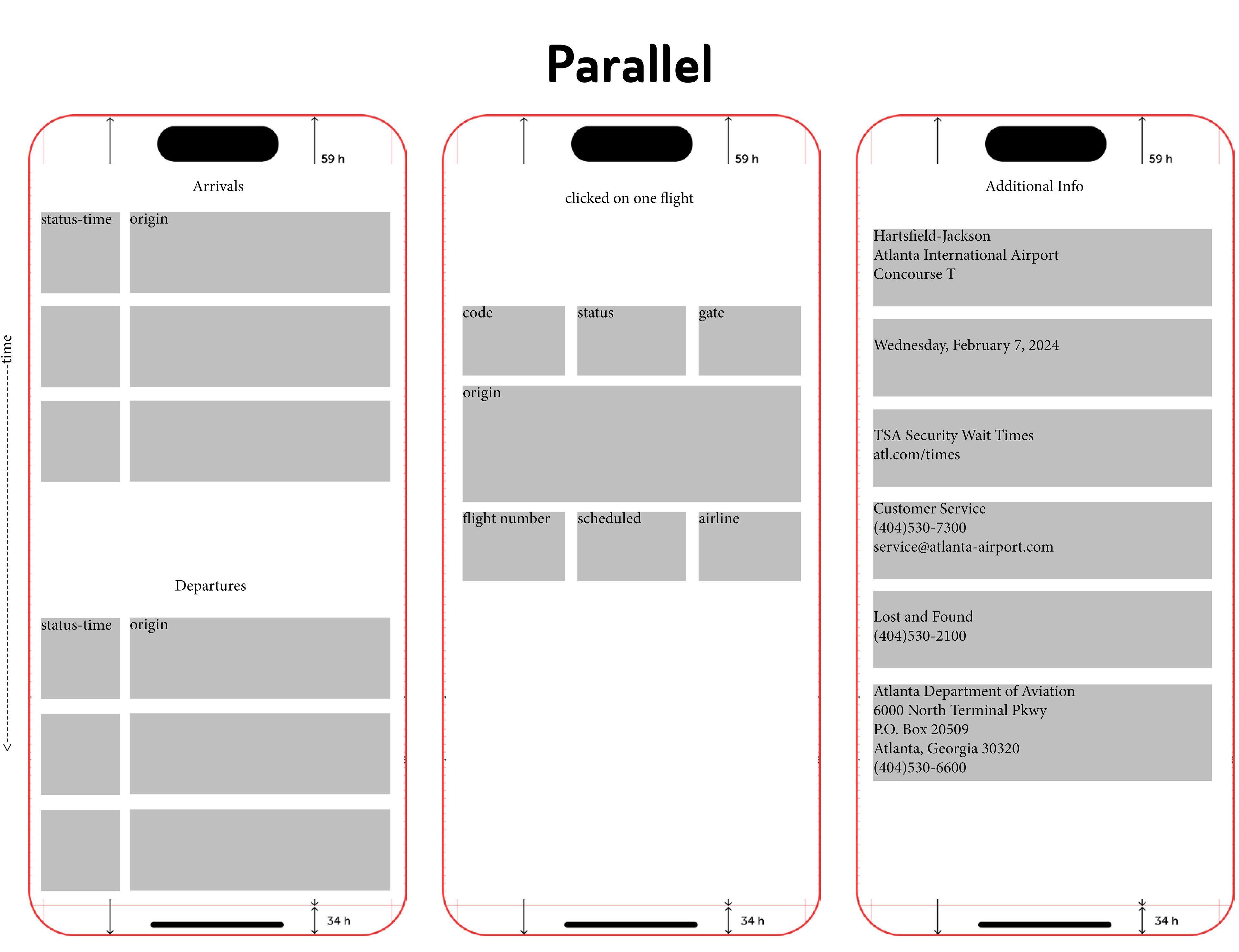
Digital Ideation
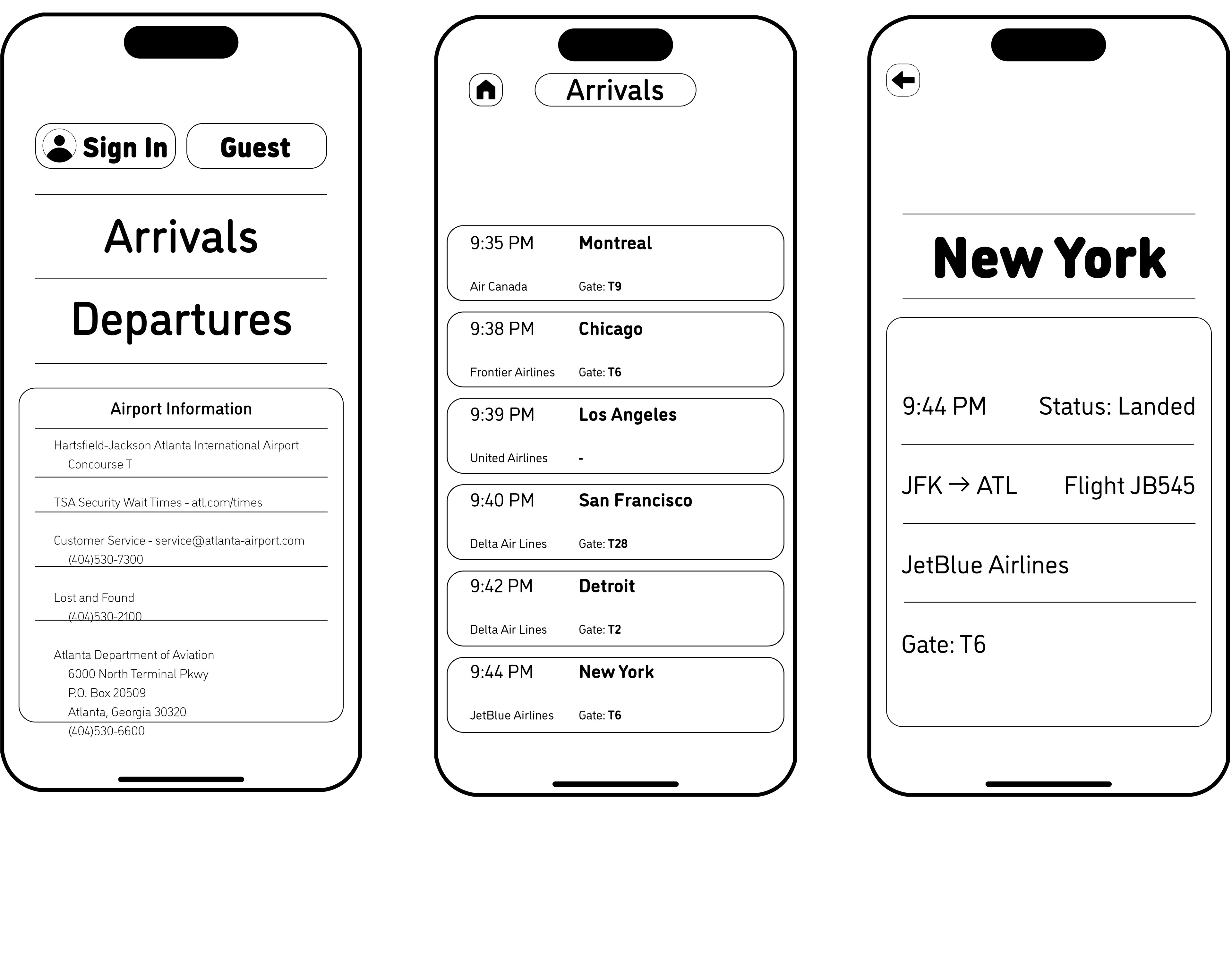
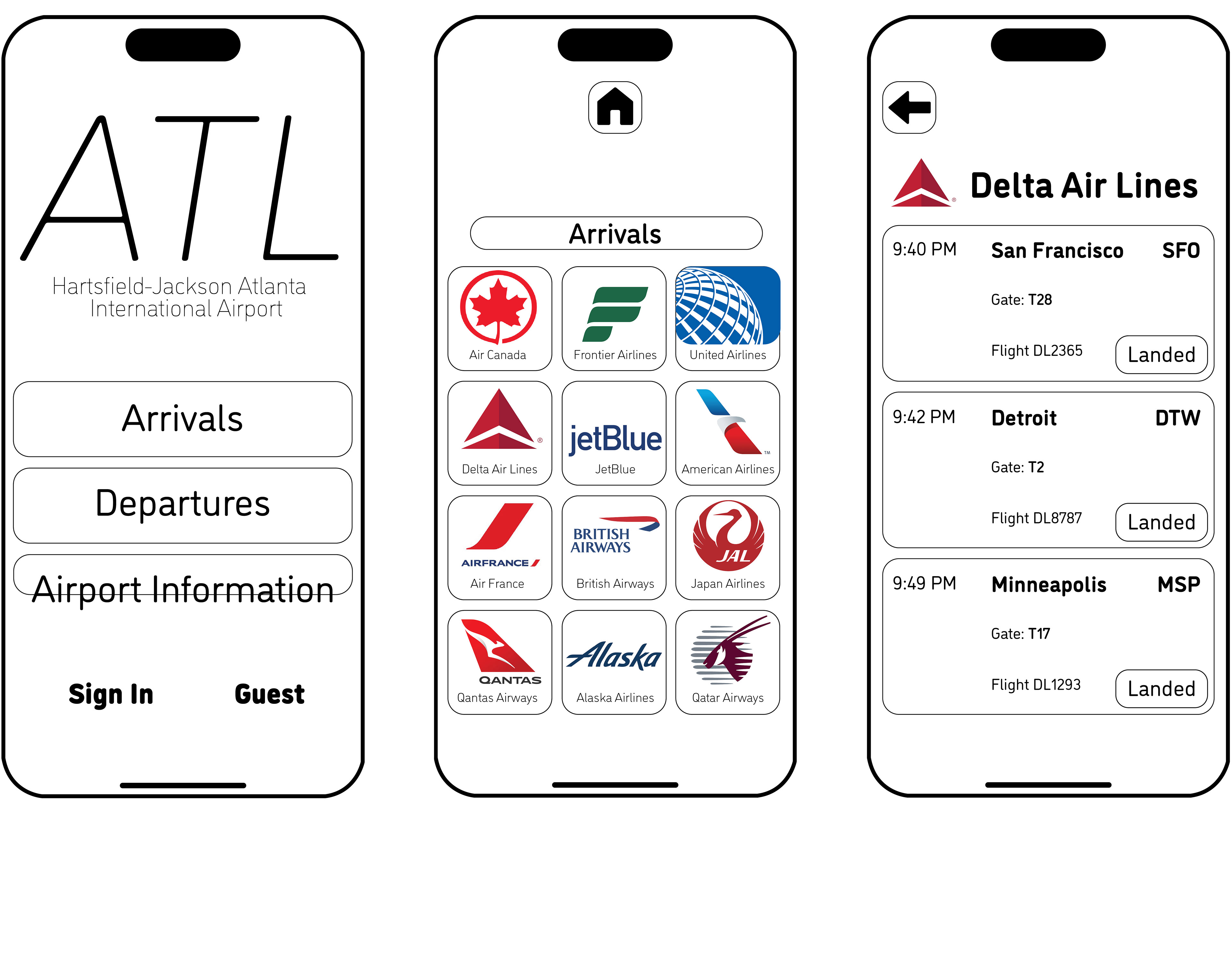
First Digital Iterations
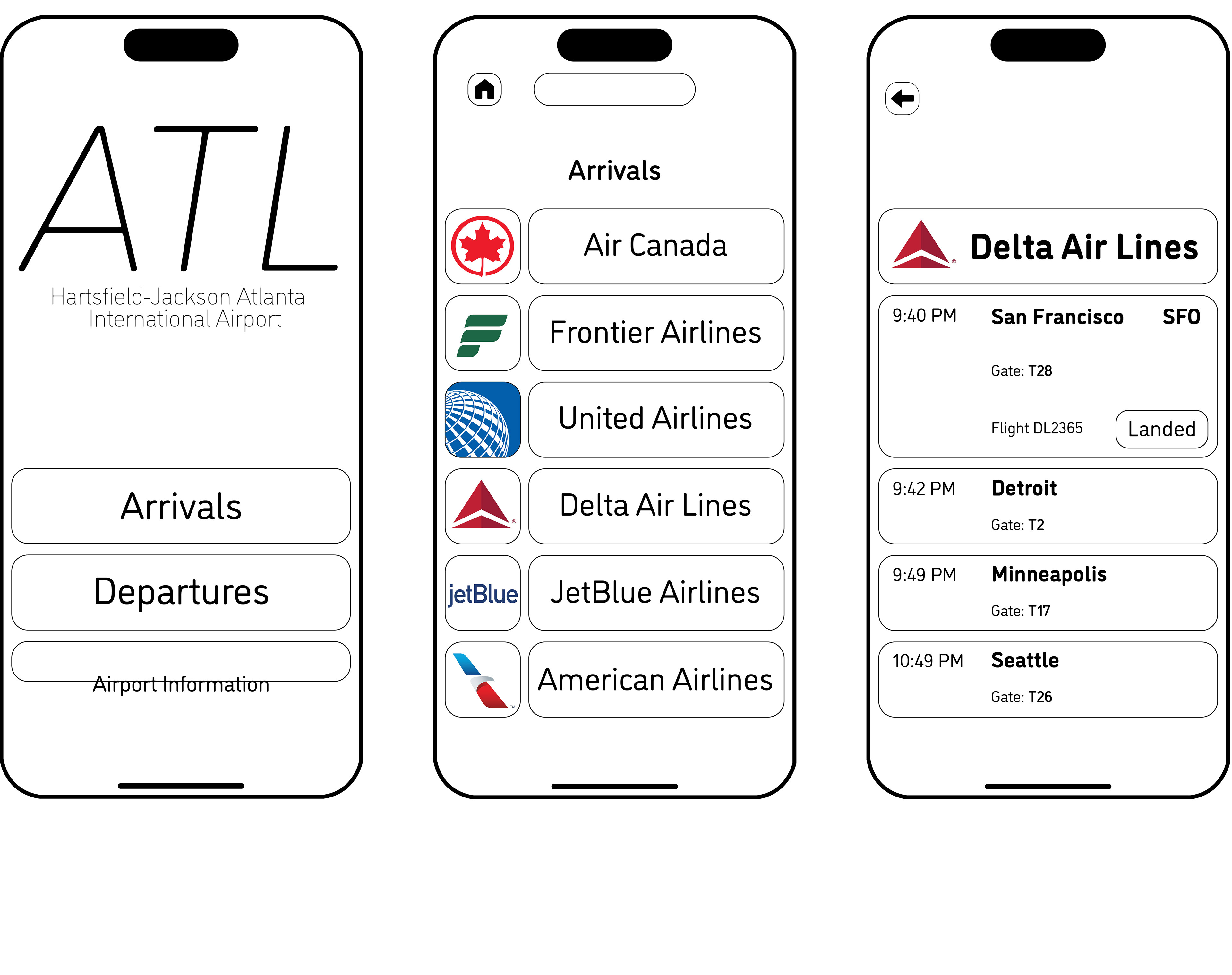
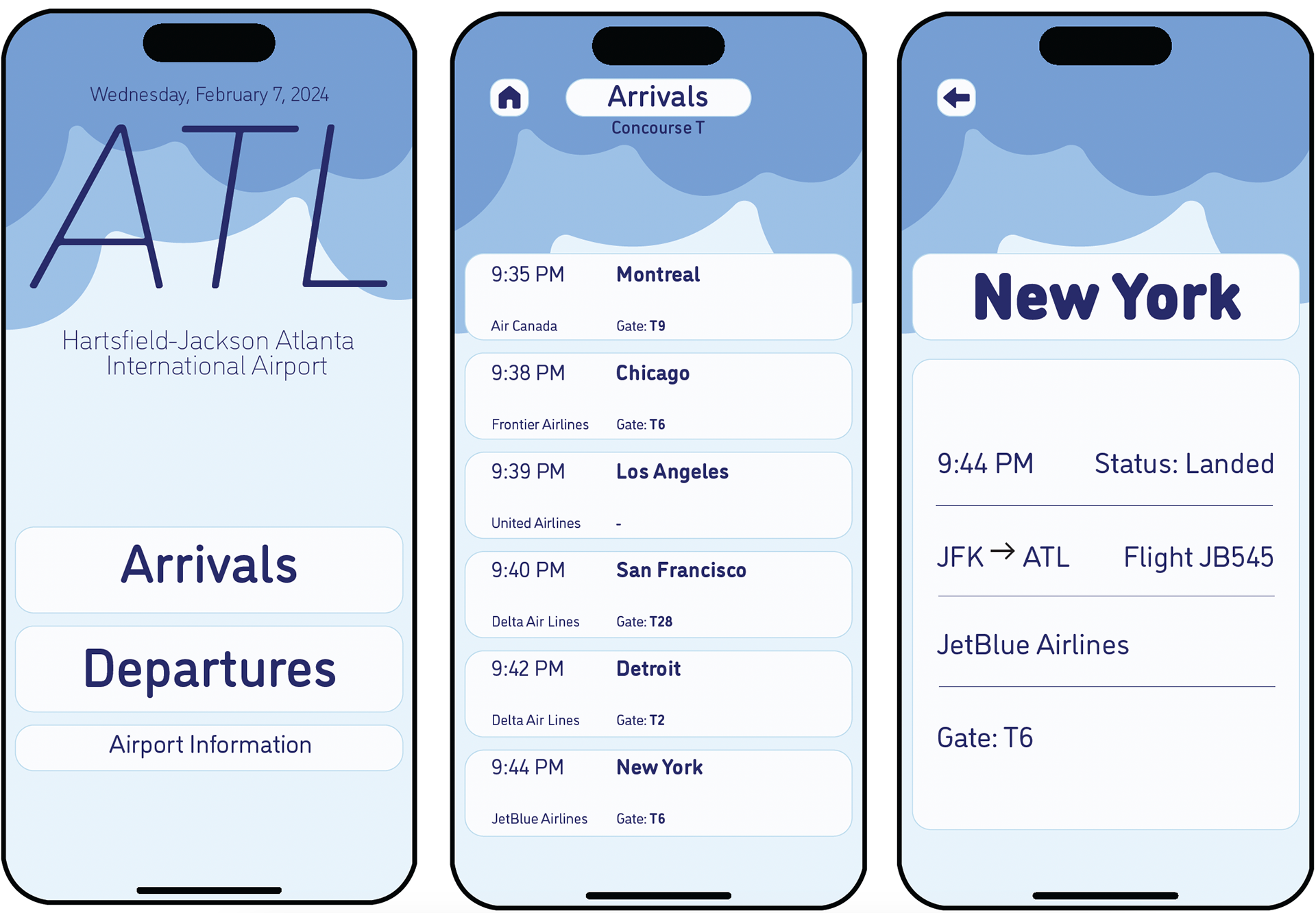
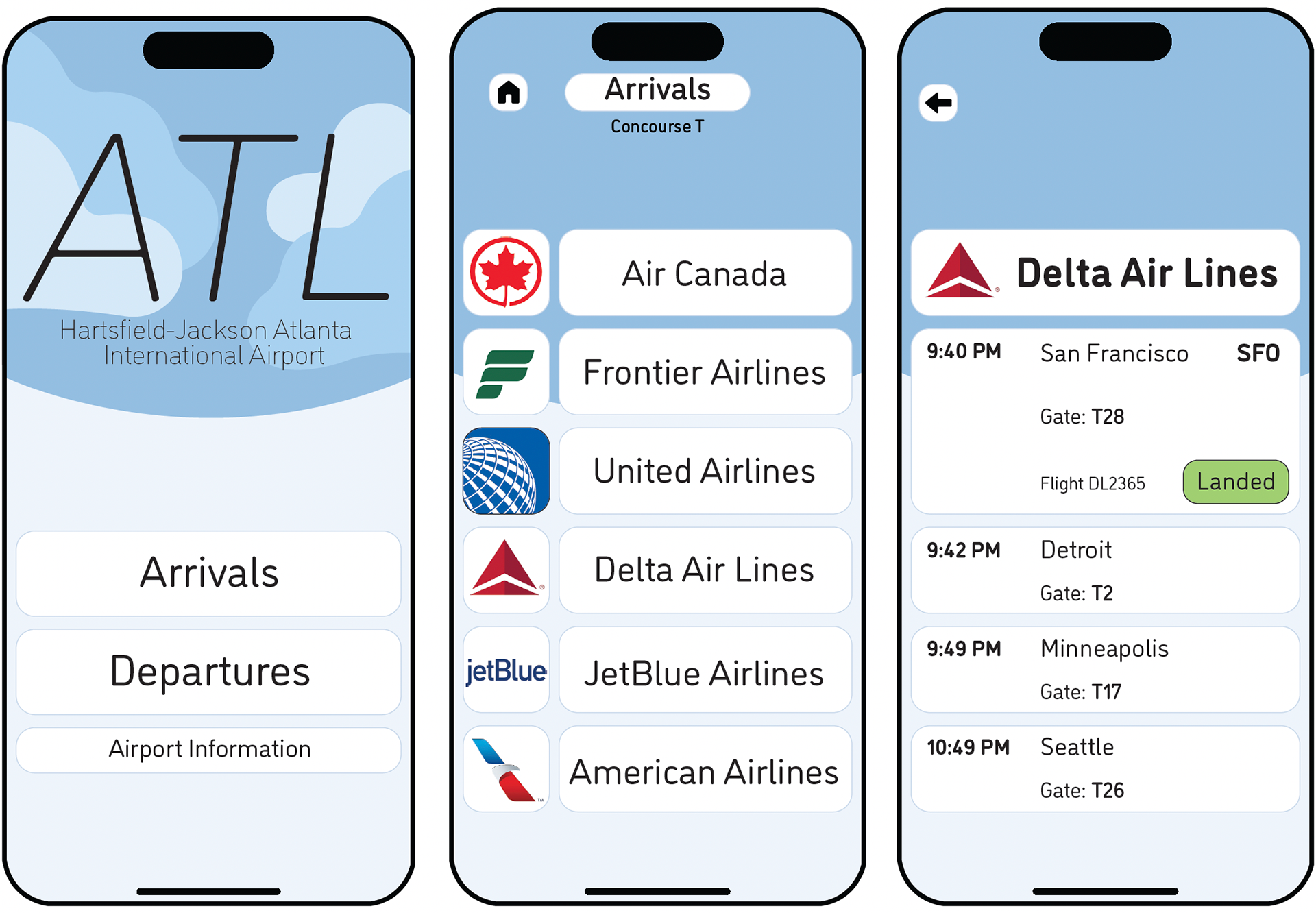
Color and font changes were implemented to help create a type hierarchy. Blue hues and cloud visuals were incorporated to resemble the sky. Many typefaces and font styles were tested to help further establish a hierarchy and to create a friendly, but professional atmosphere.
Second Digital Iterations
Final
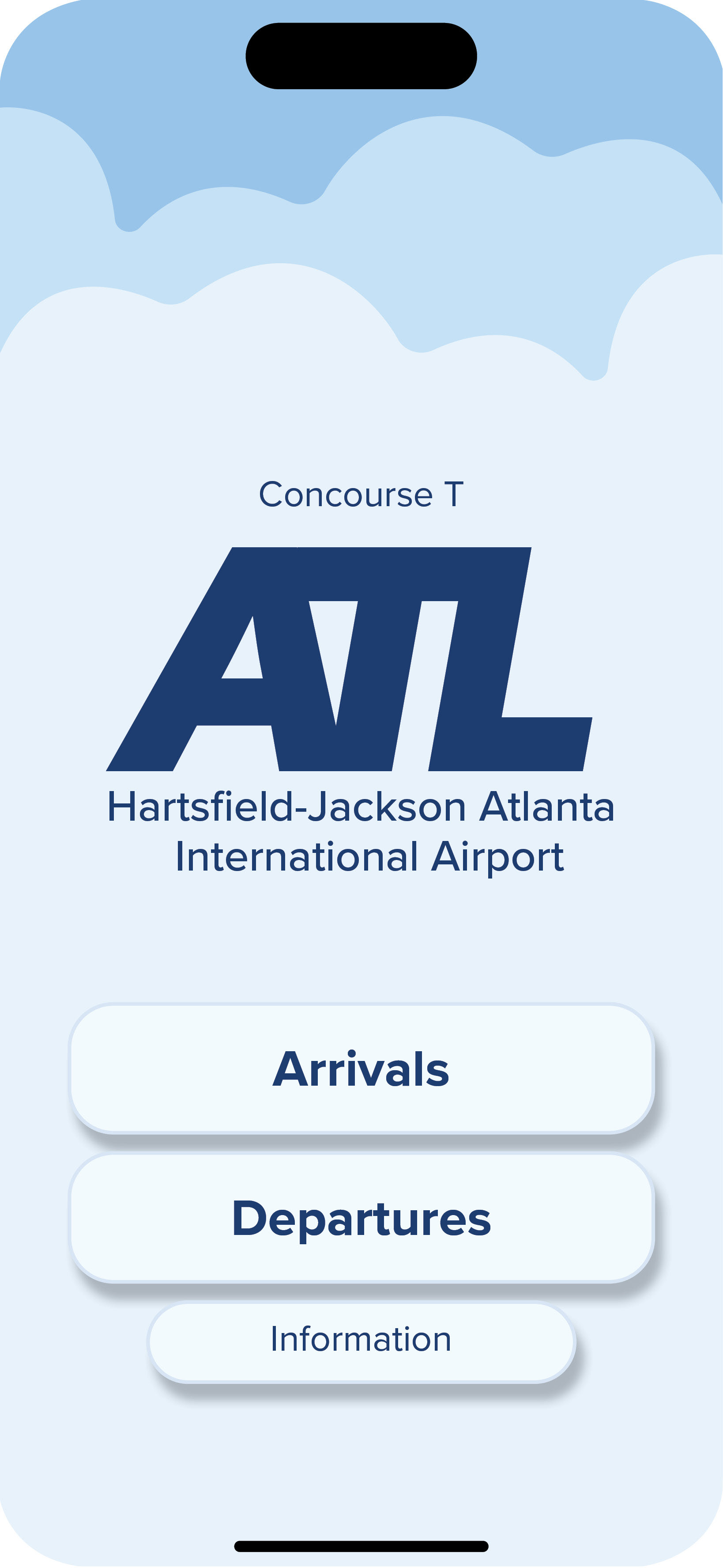
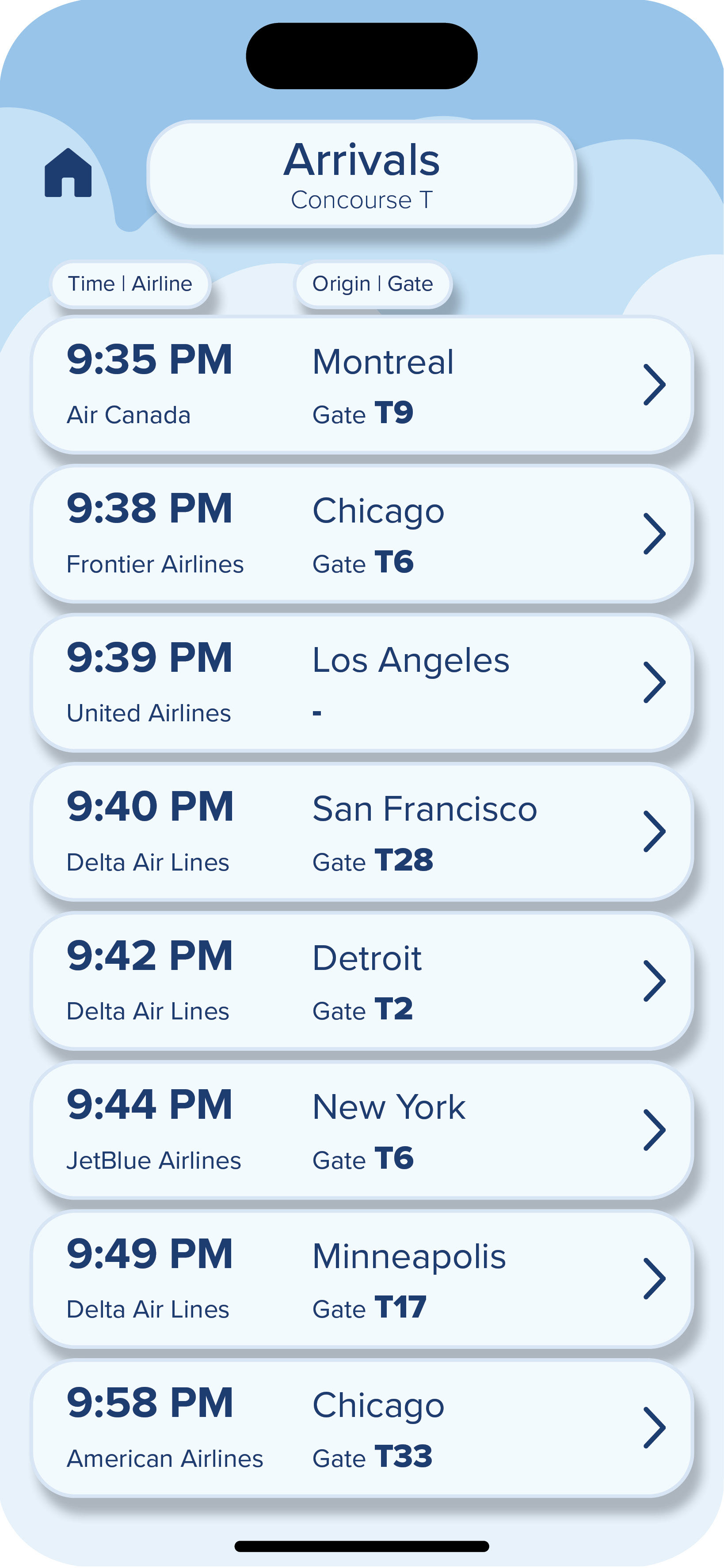
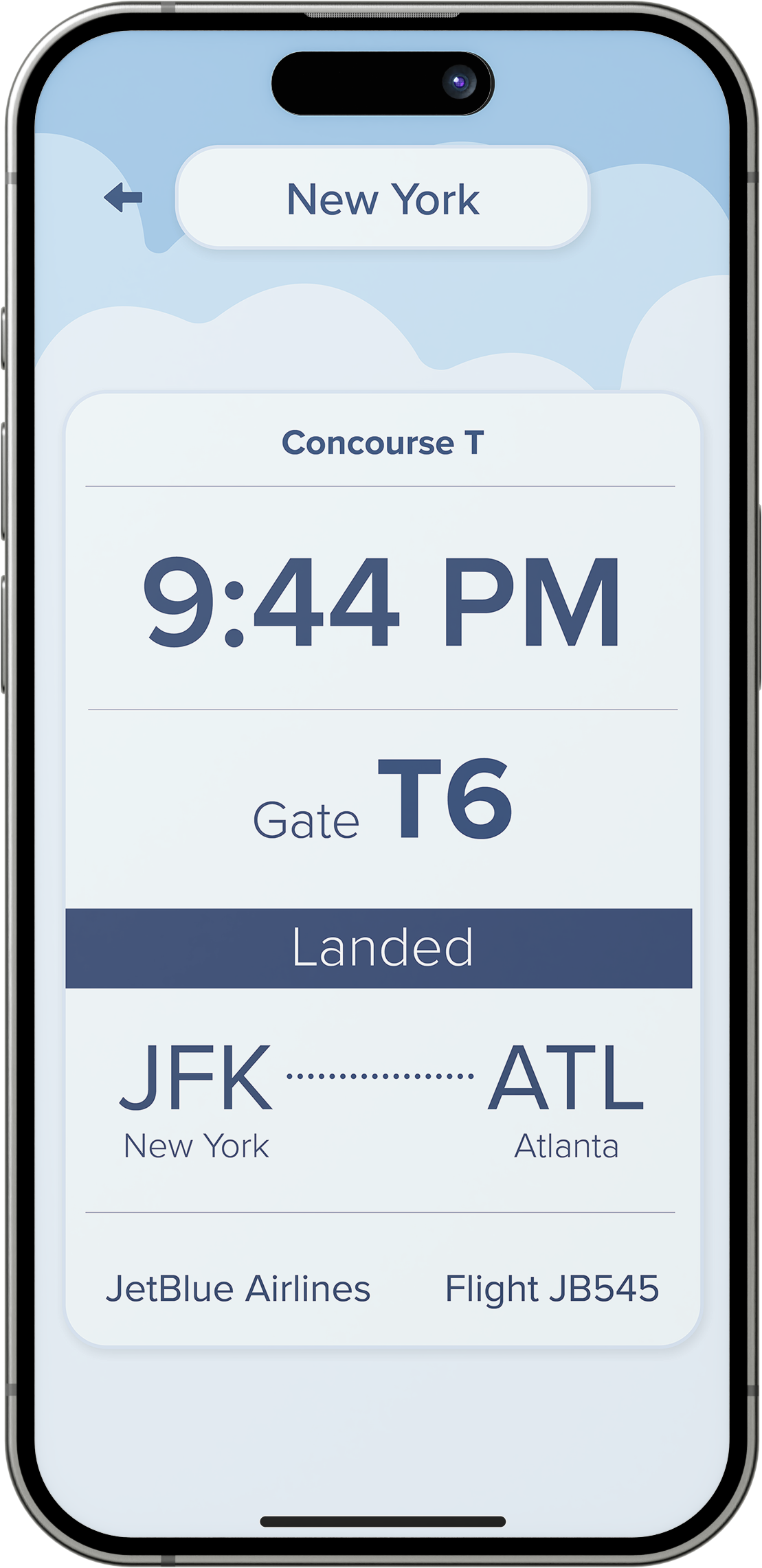
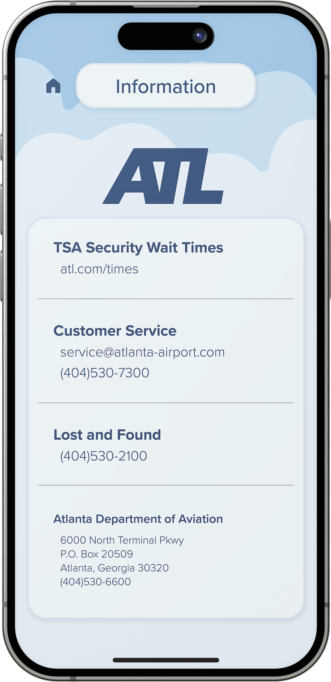
The final interface design utilizes a light blue cloud background to illustrate the airplane theme. The most important information is bolded so that the eyes are drawn to what needs to be seen first. The information can be explored linearly and clearly. Visually impaired users can use the app with ease. The video below shows how each page flows into one another.
Video Interaction


