
Objective
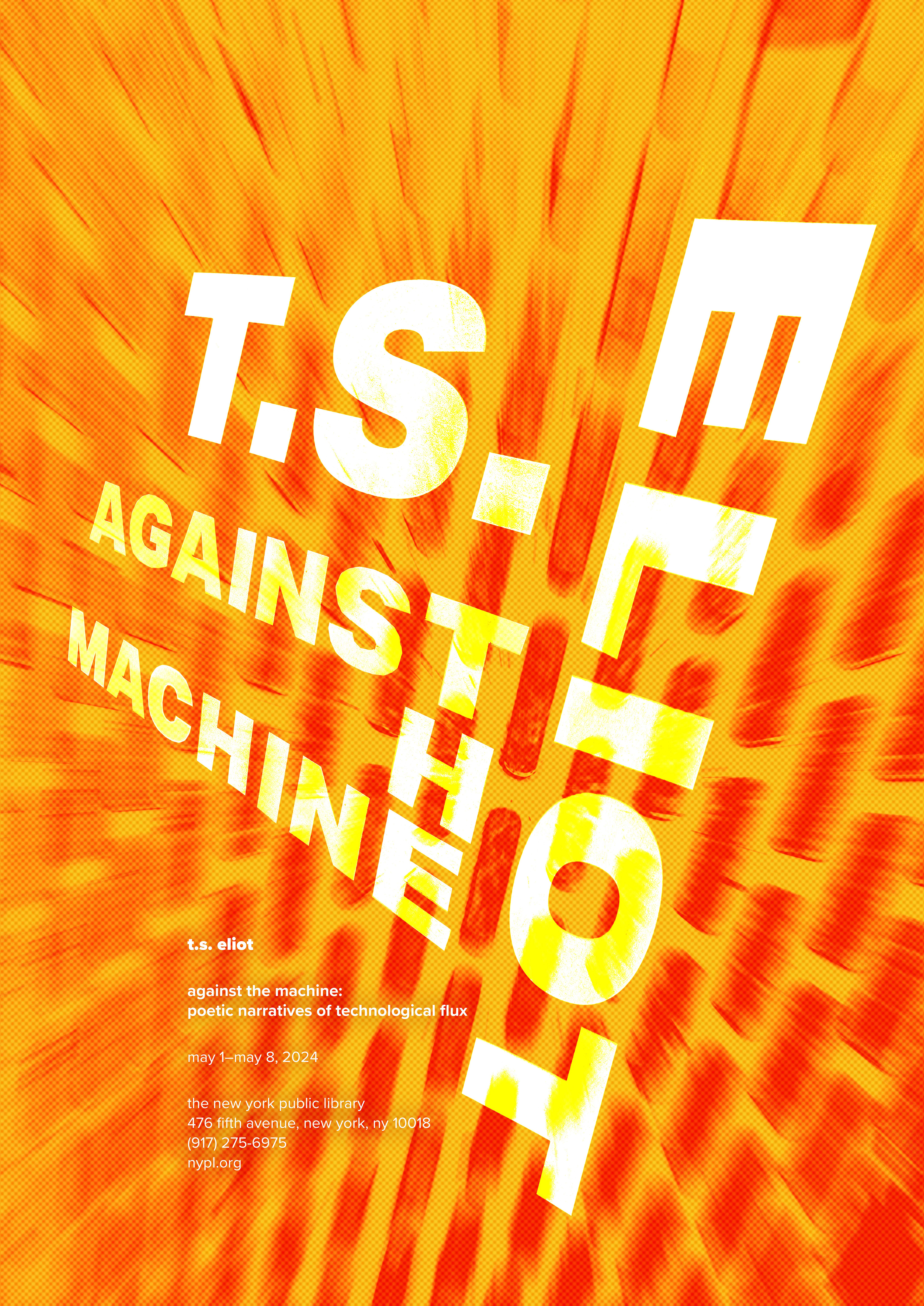
This poster series is an advertisement for a showcase of poets whose work embodies
the idea of being "Against The Machine." The concept of this poetry exhibition centers around gentrification, sentience, existential crises, and destruction after a war. Machinery, wastefulness, and structure were a highlight of both the posters and
the poetry.
the idea of being "Against The Machine." The concept of this poetry exhibition centers around gentrification, sentience, existential crises, and destruction after a war. Machinery, wastefulness, and structure were a highlight of both the posters and
the poetry.
Understanding The Poets
Experimental Wordplay
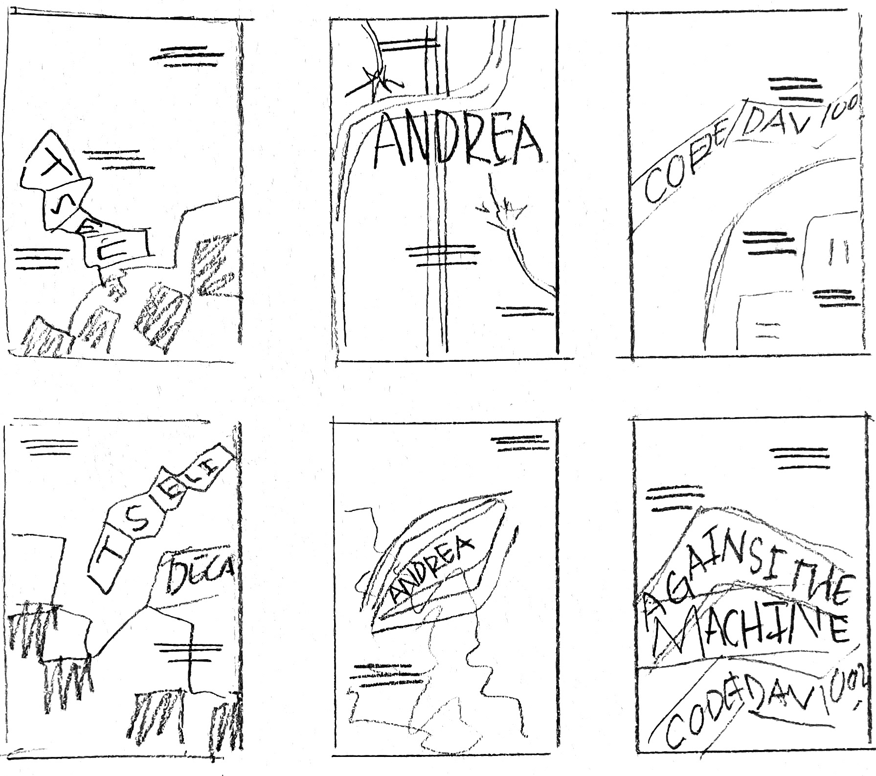
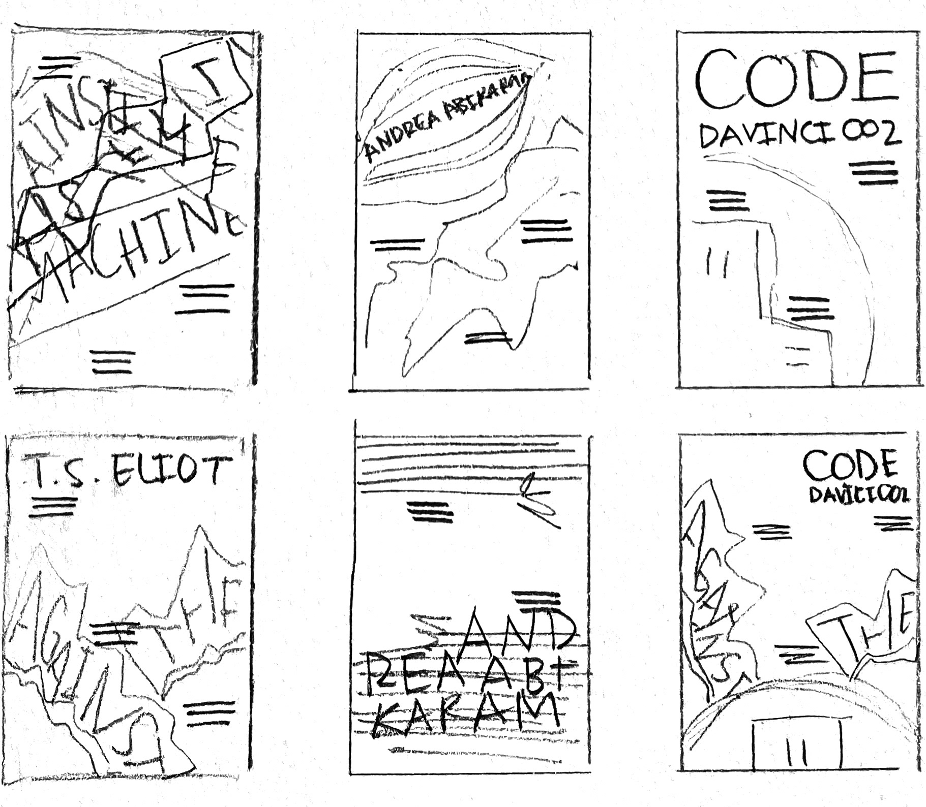
This project started by taking photos of typography, textures, and objects in a workshop environment. Important words such as the poets' names and the title were edited. These images were then sketched out into possible layouts.
Sketches
Color and Typography
First Round Digital Iterations
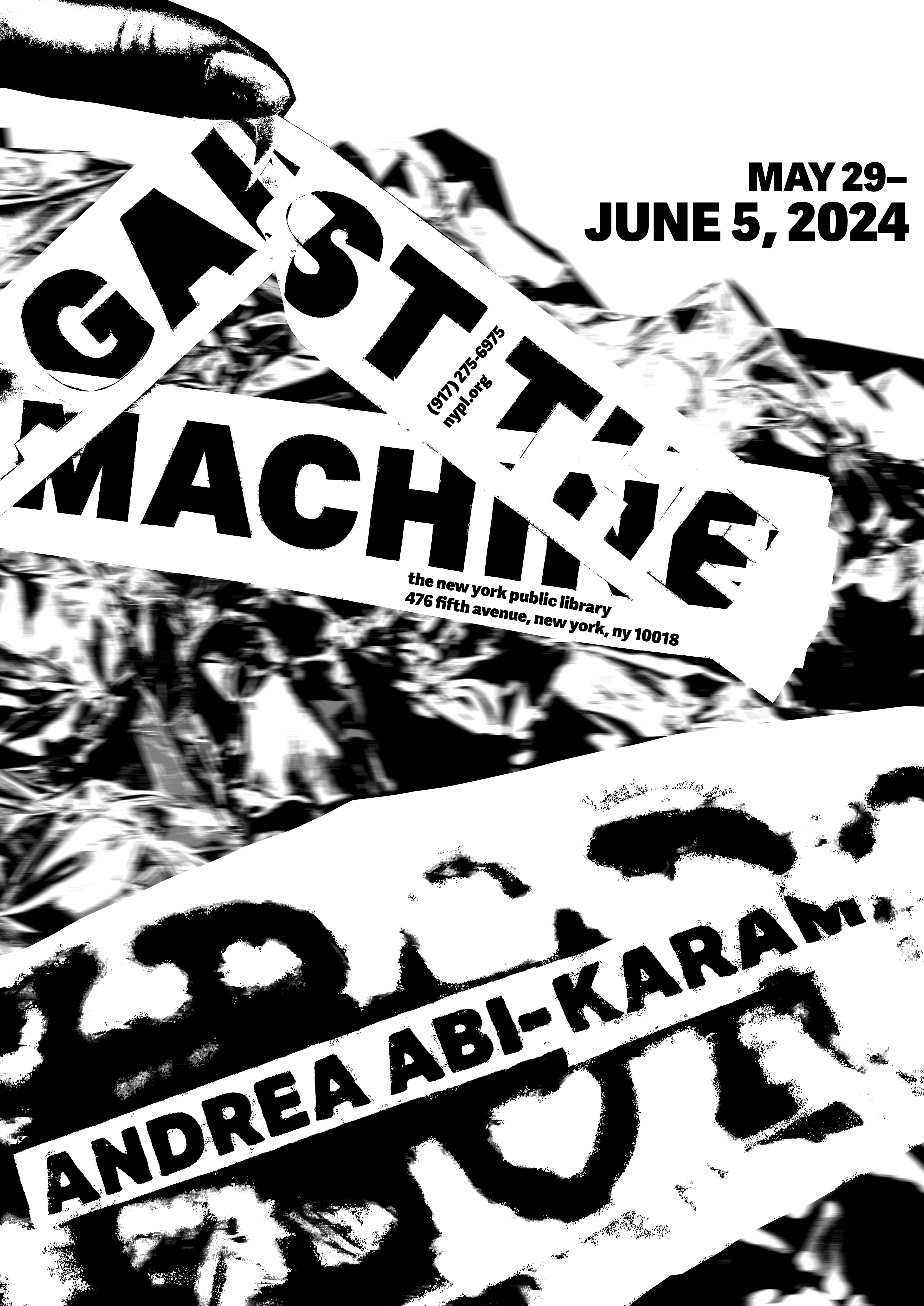
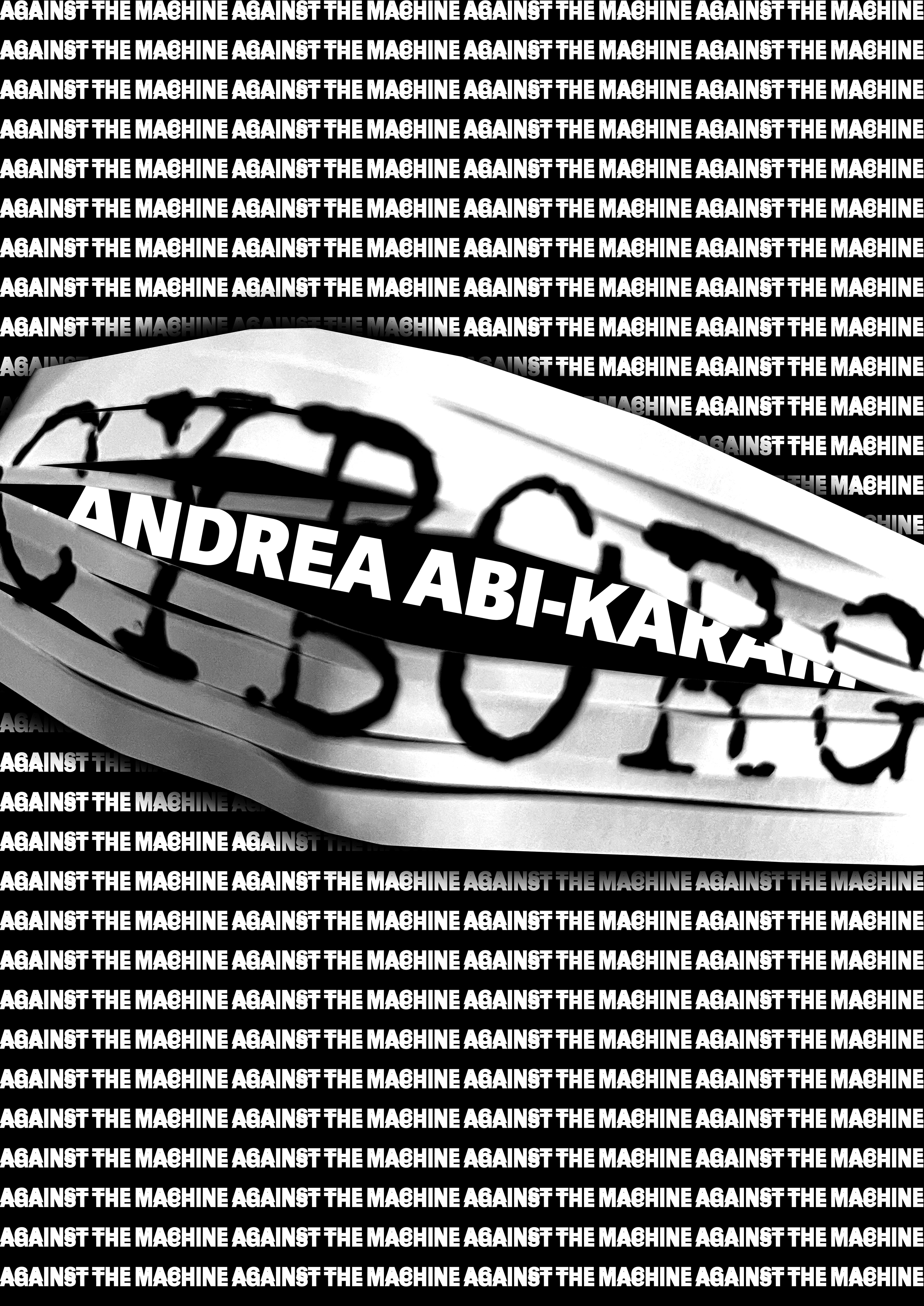
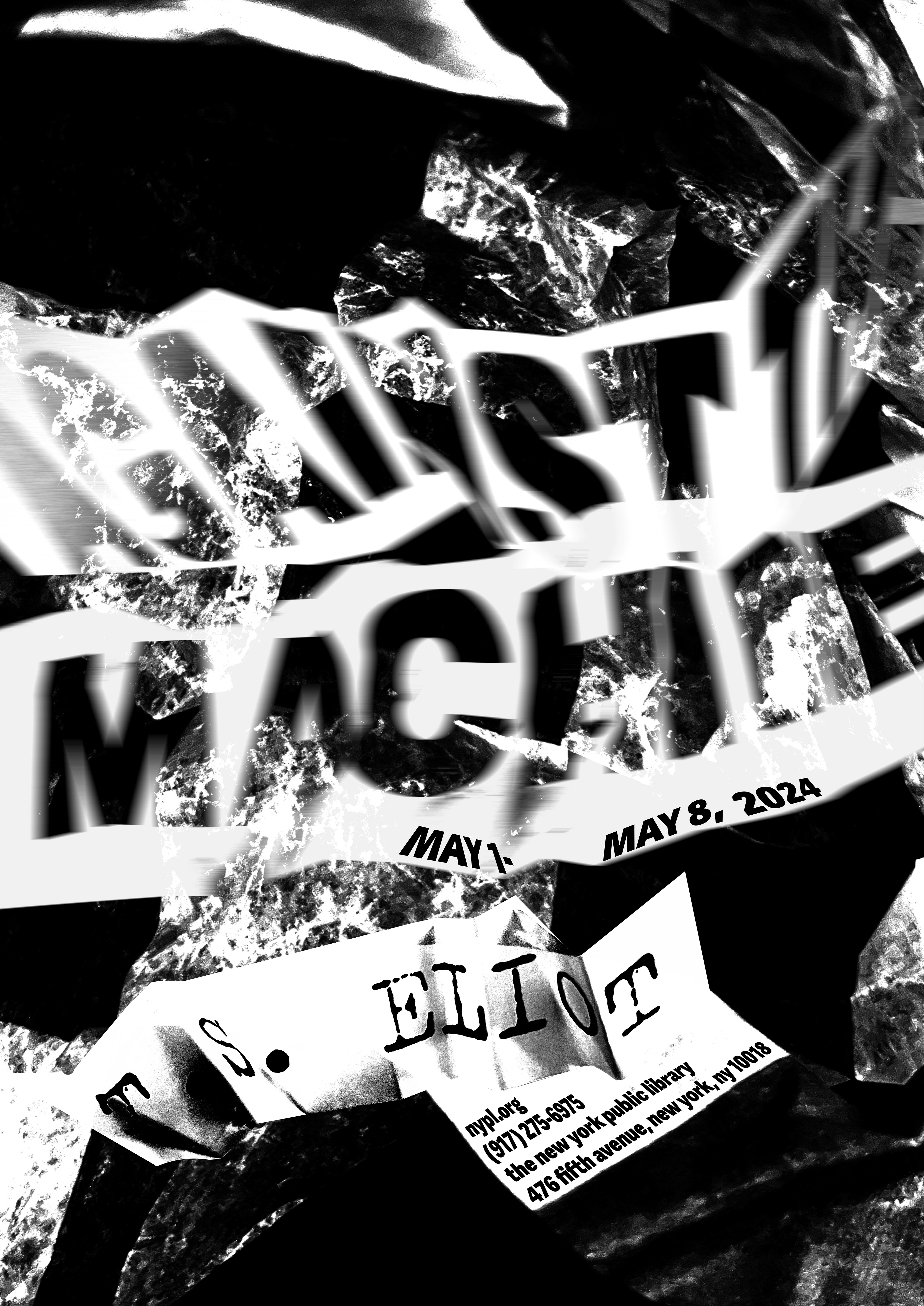
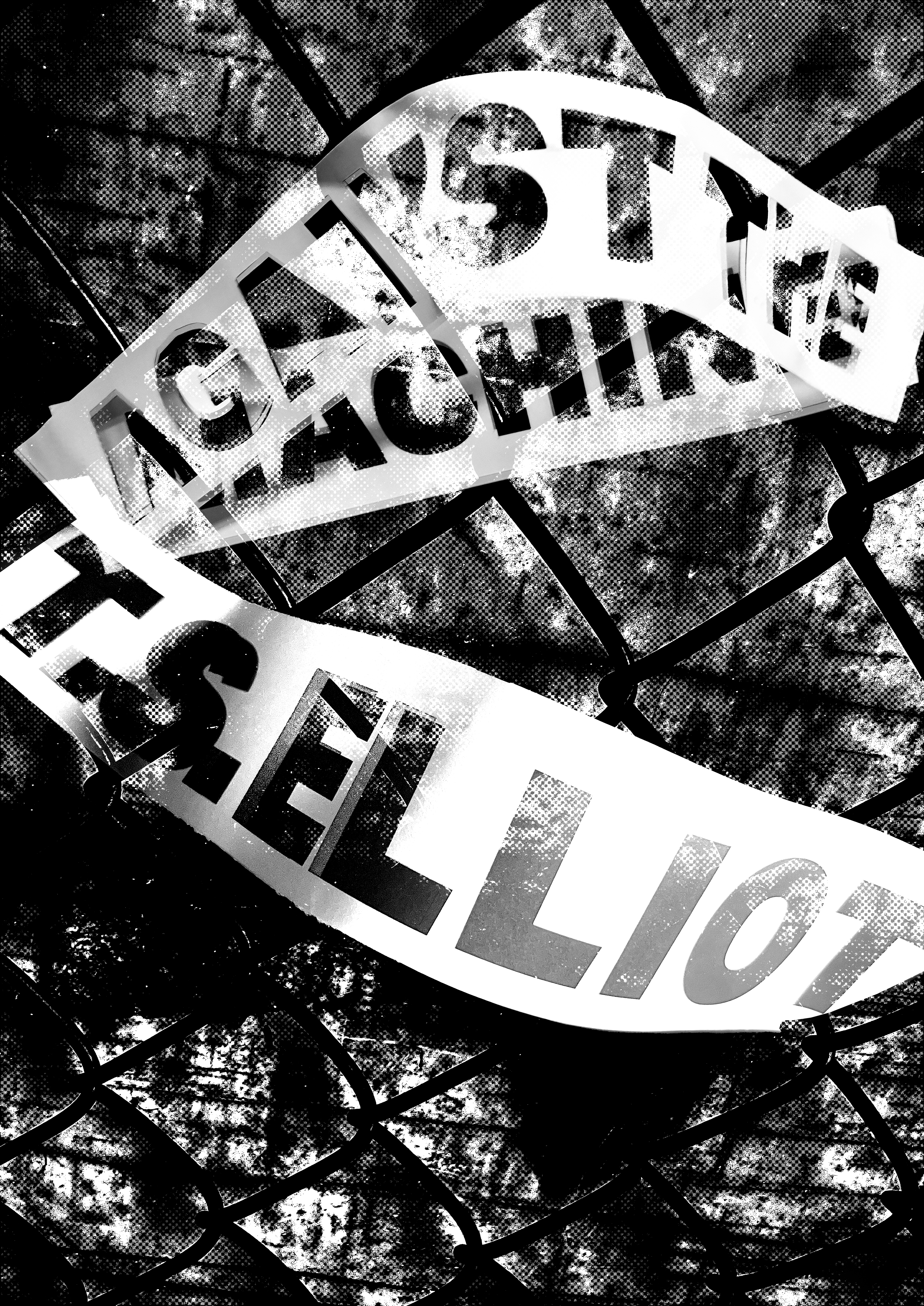
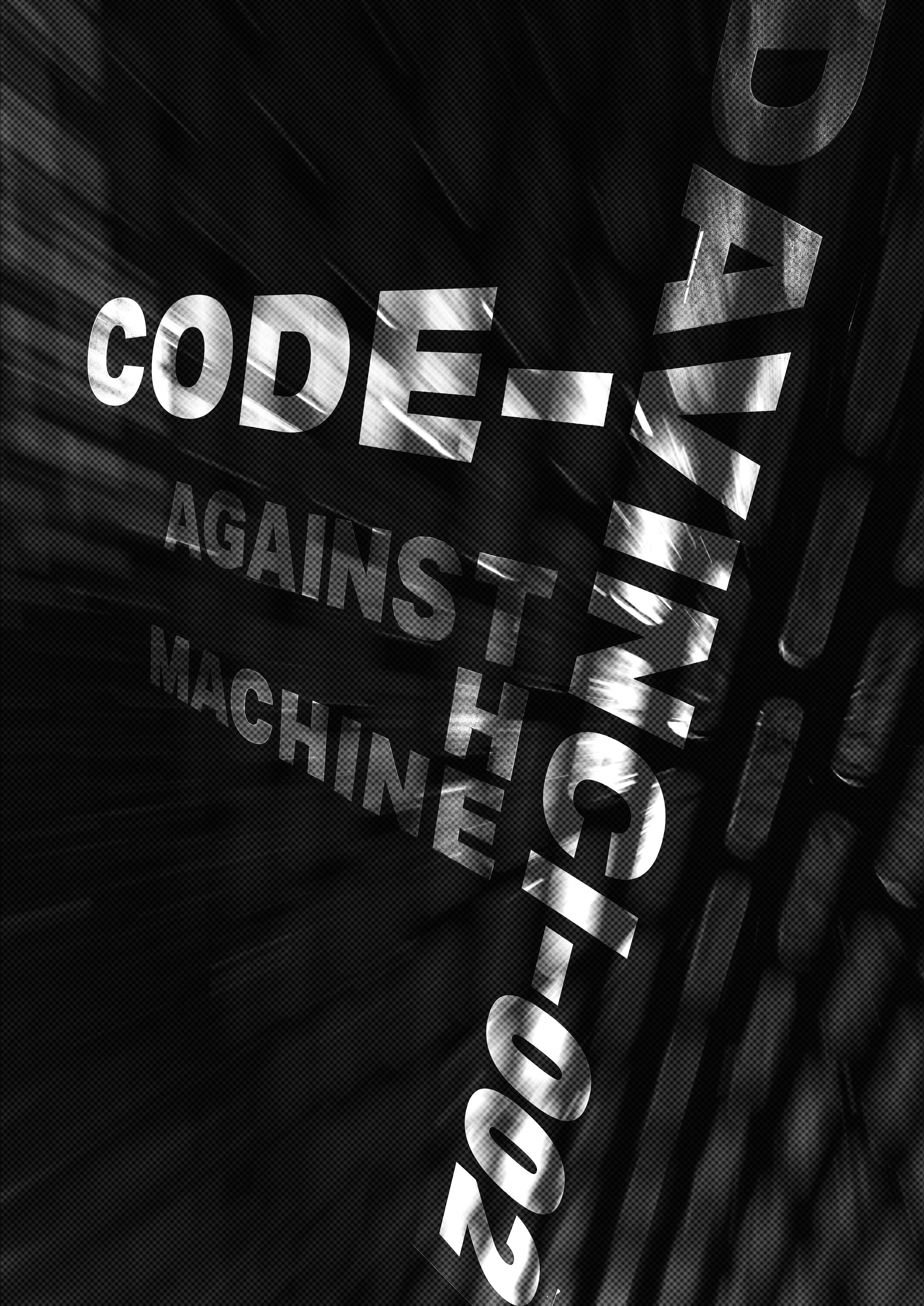
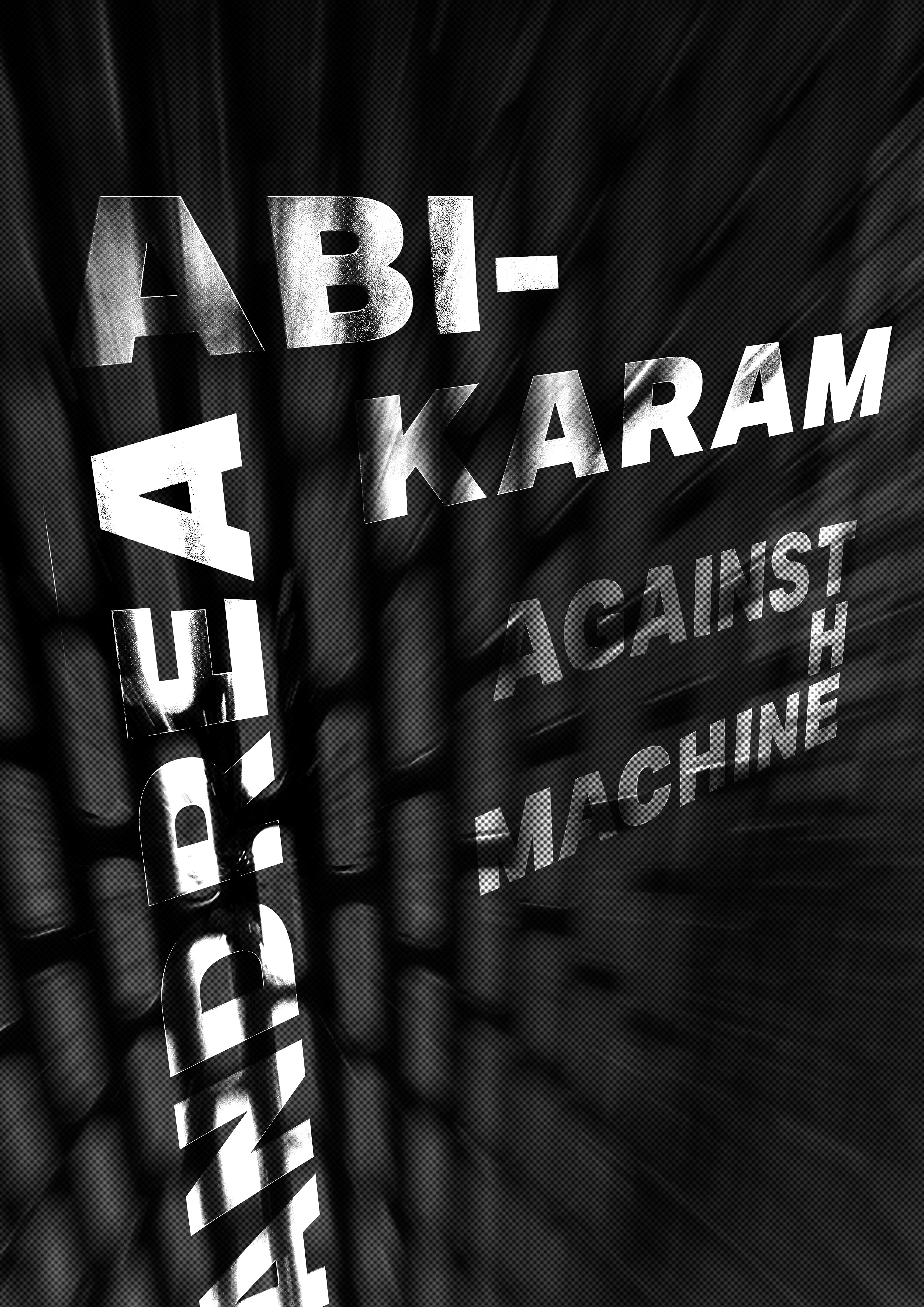
Sketches were then taken back into Photoshop to further conceptualize composition. Certain poster ideas started to take away from the typography. More digital iteration had to take place to find stronger concepts.
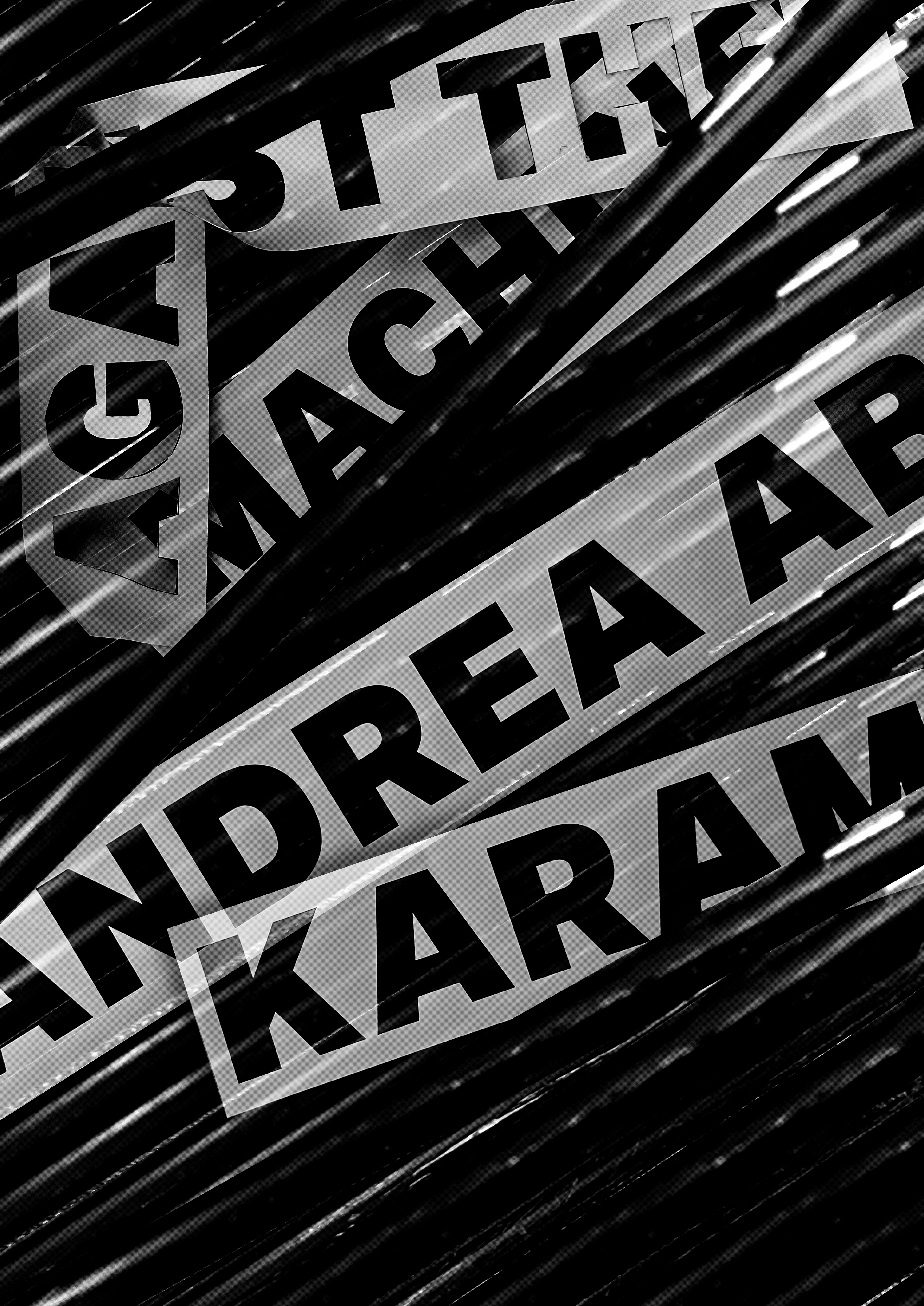
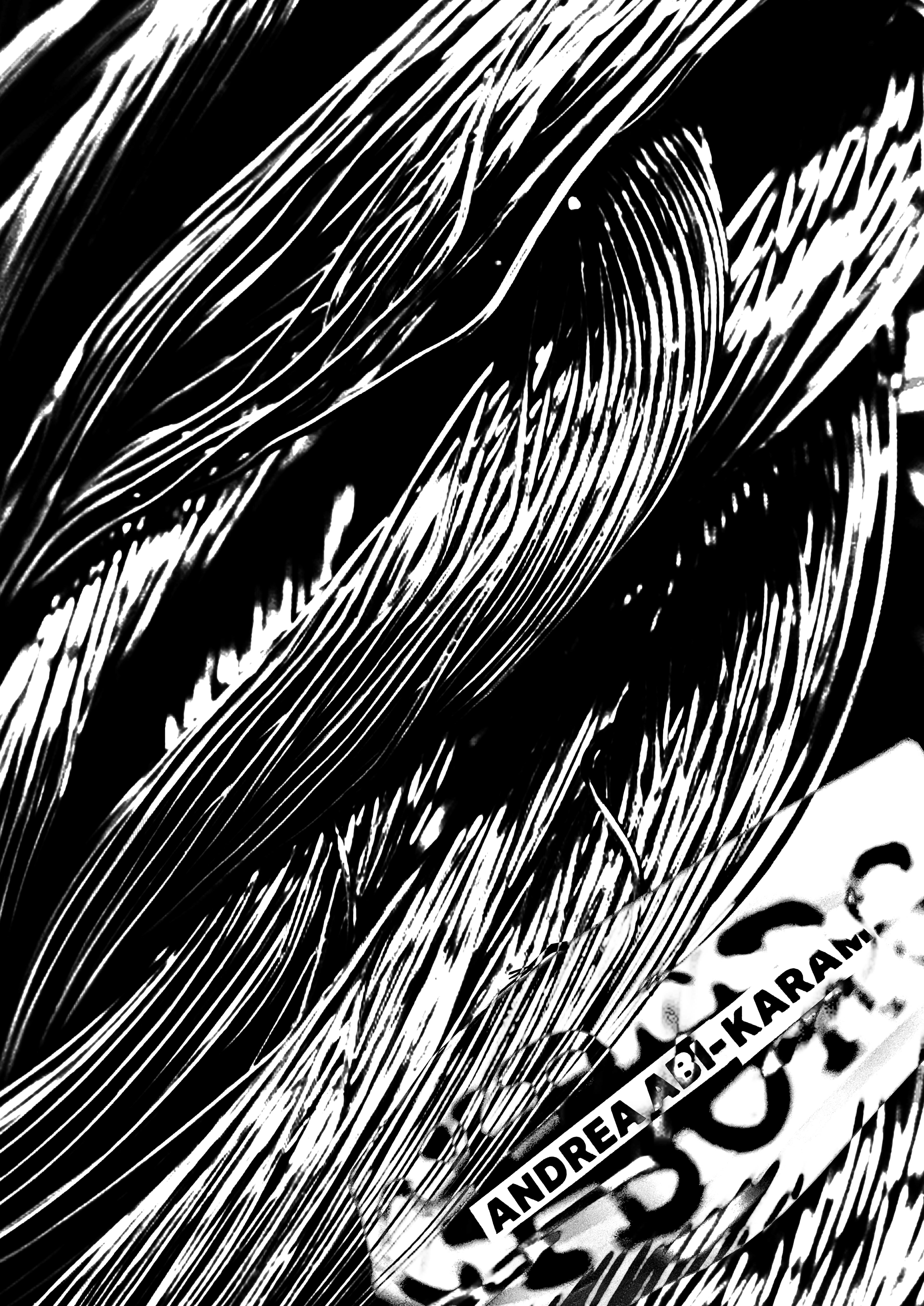
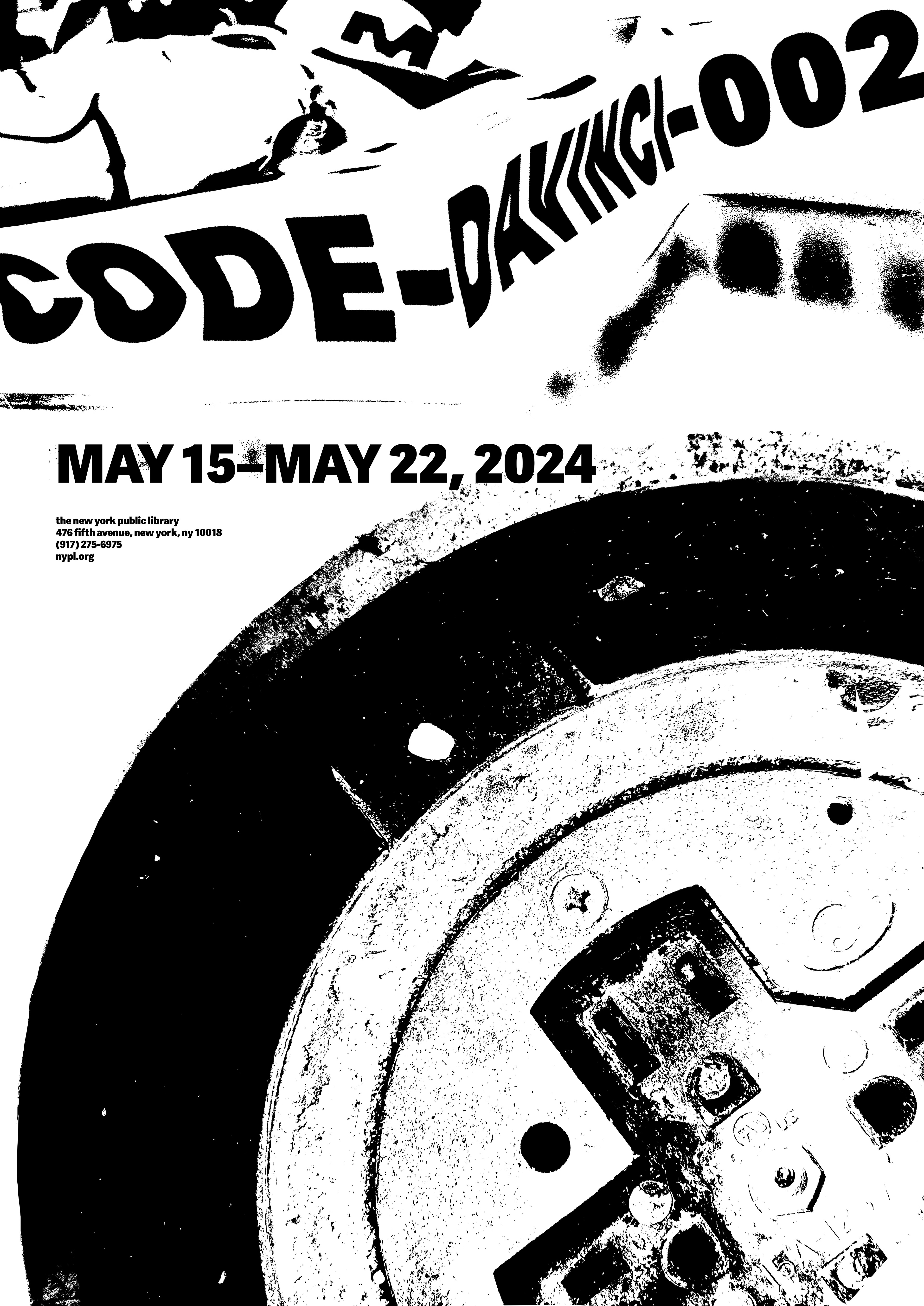
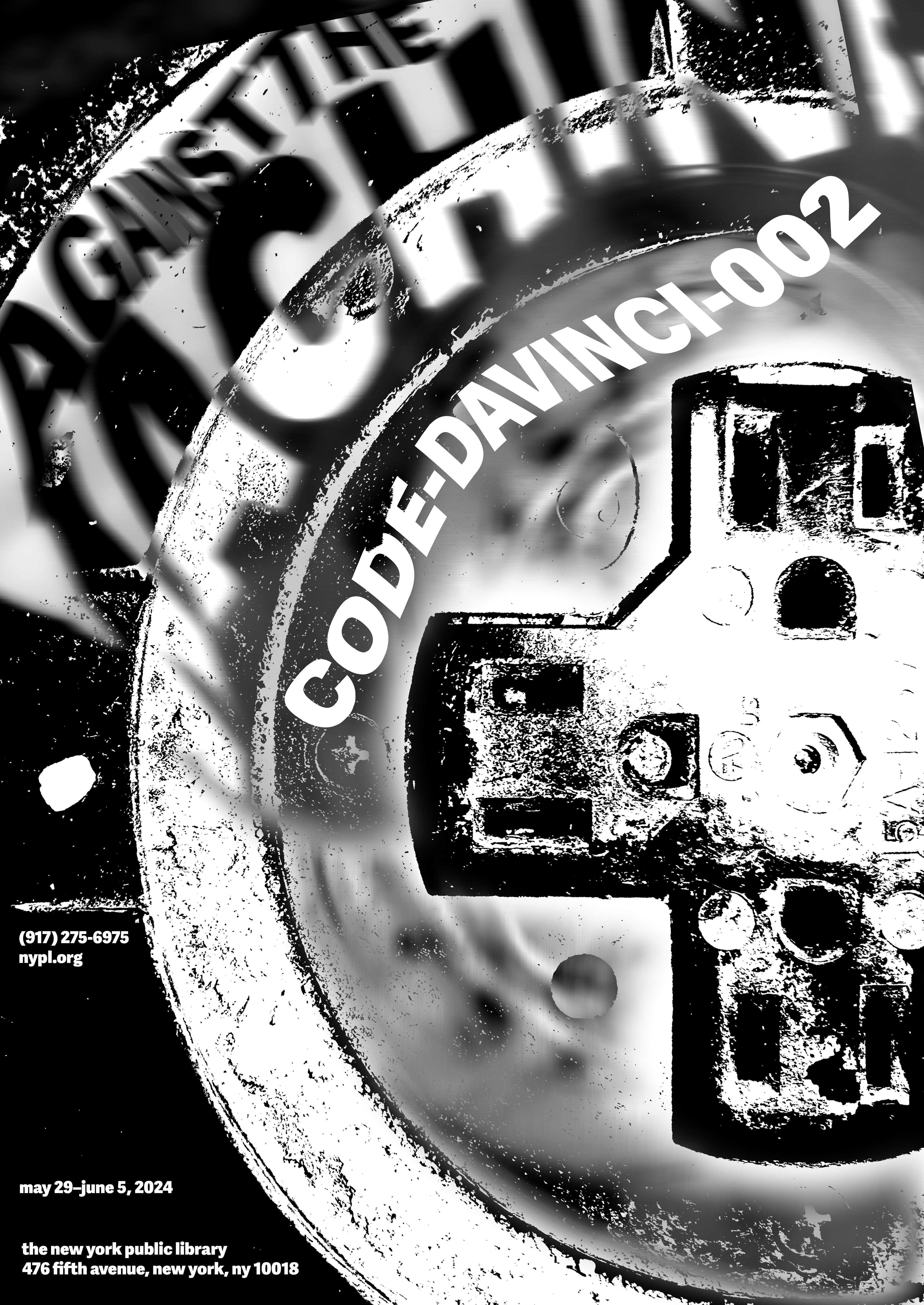
Second Round Digital Iterations
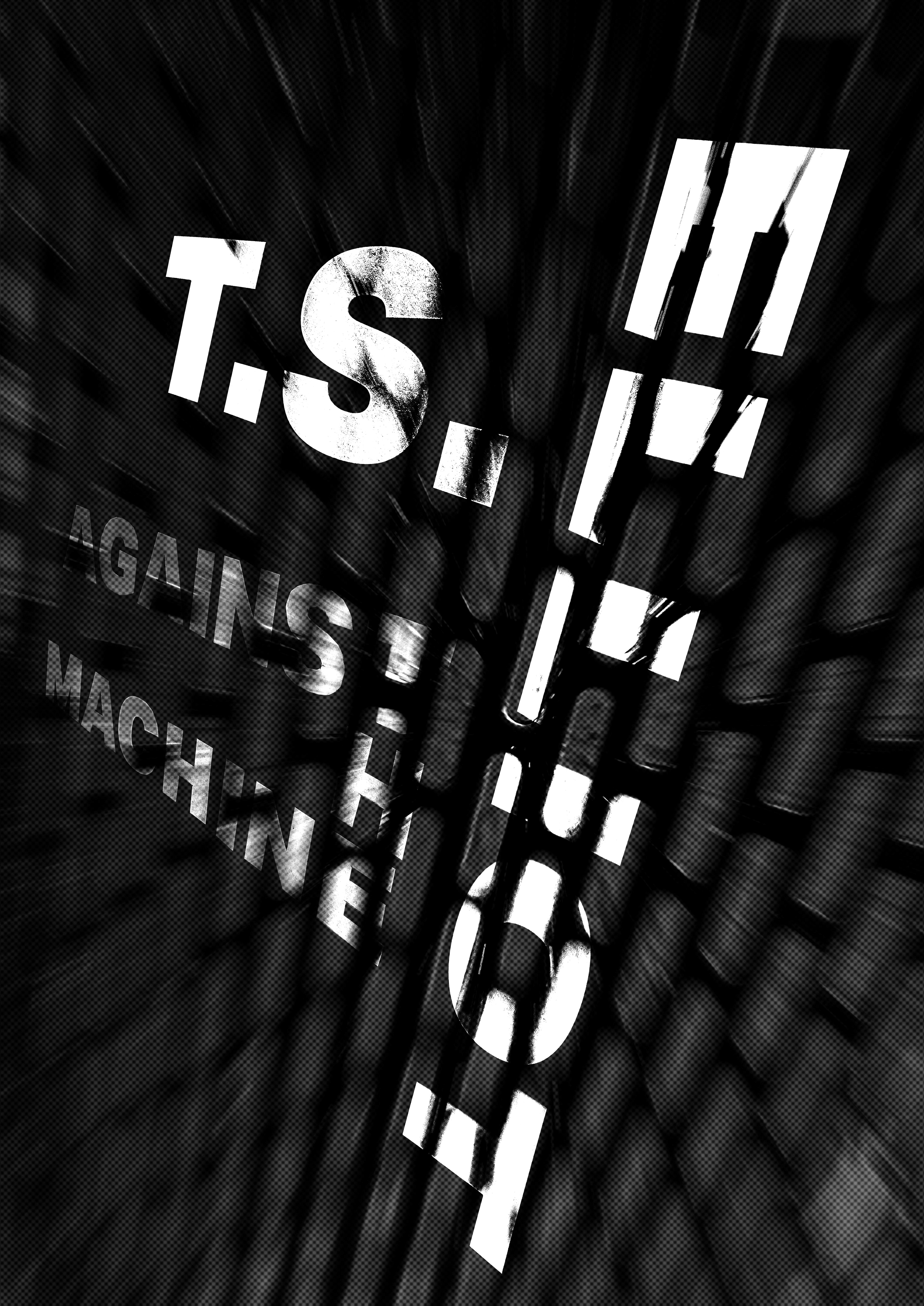
Color Experimentation
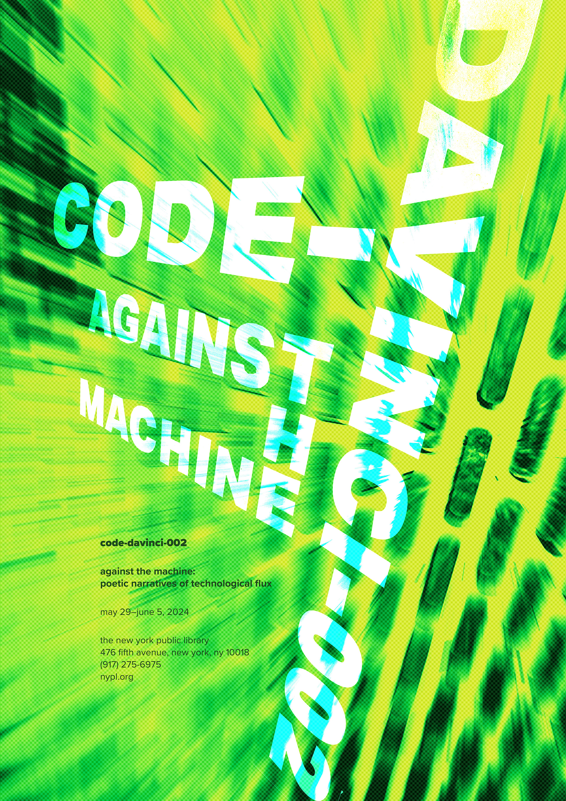
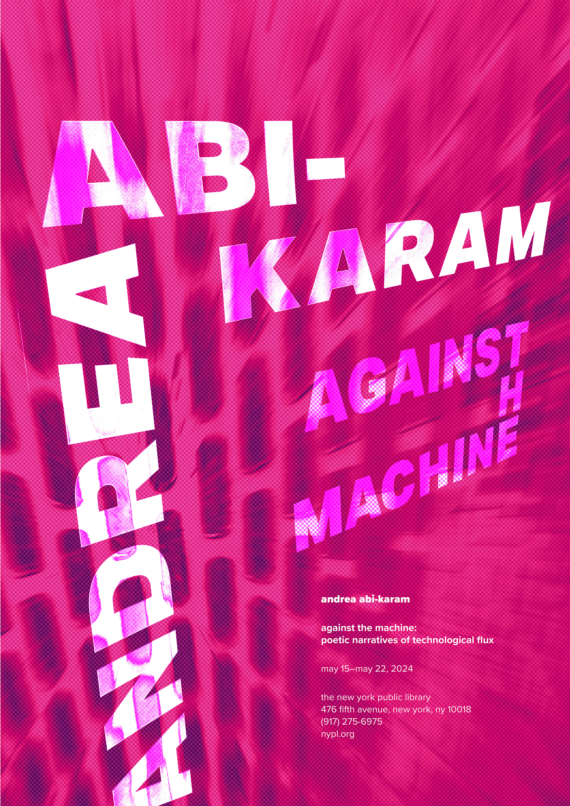
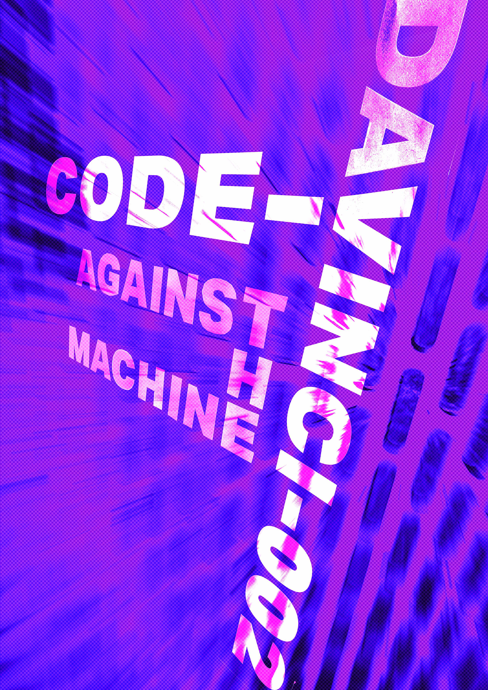
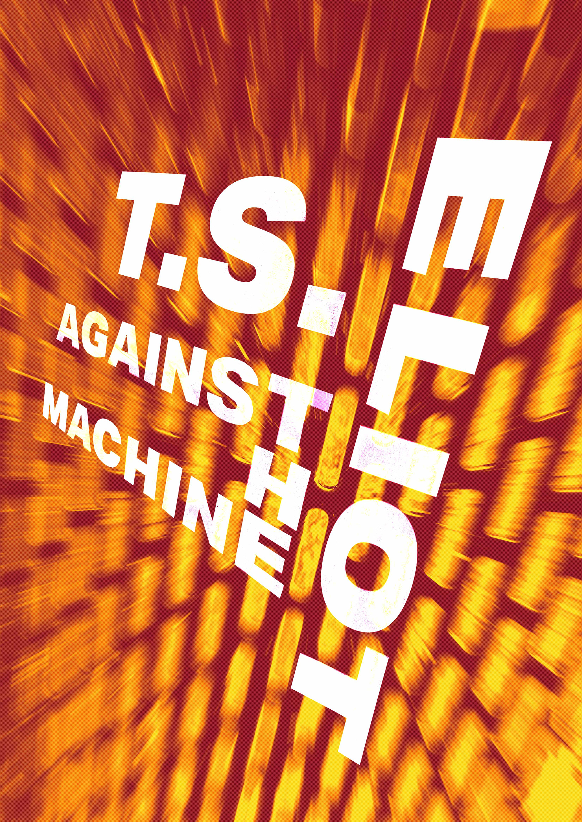
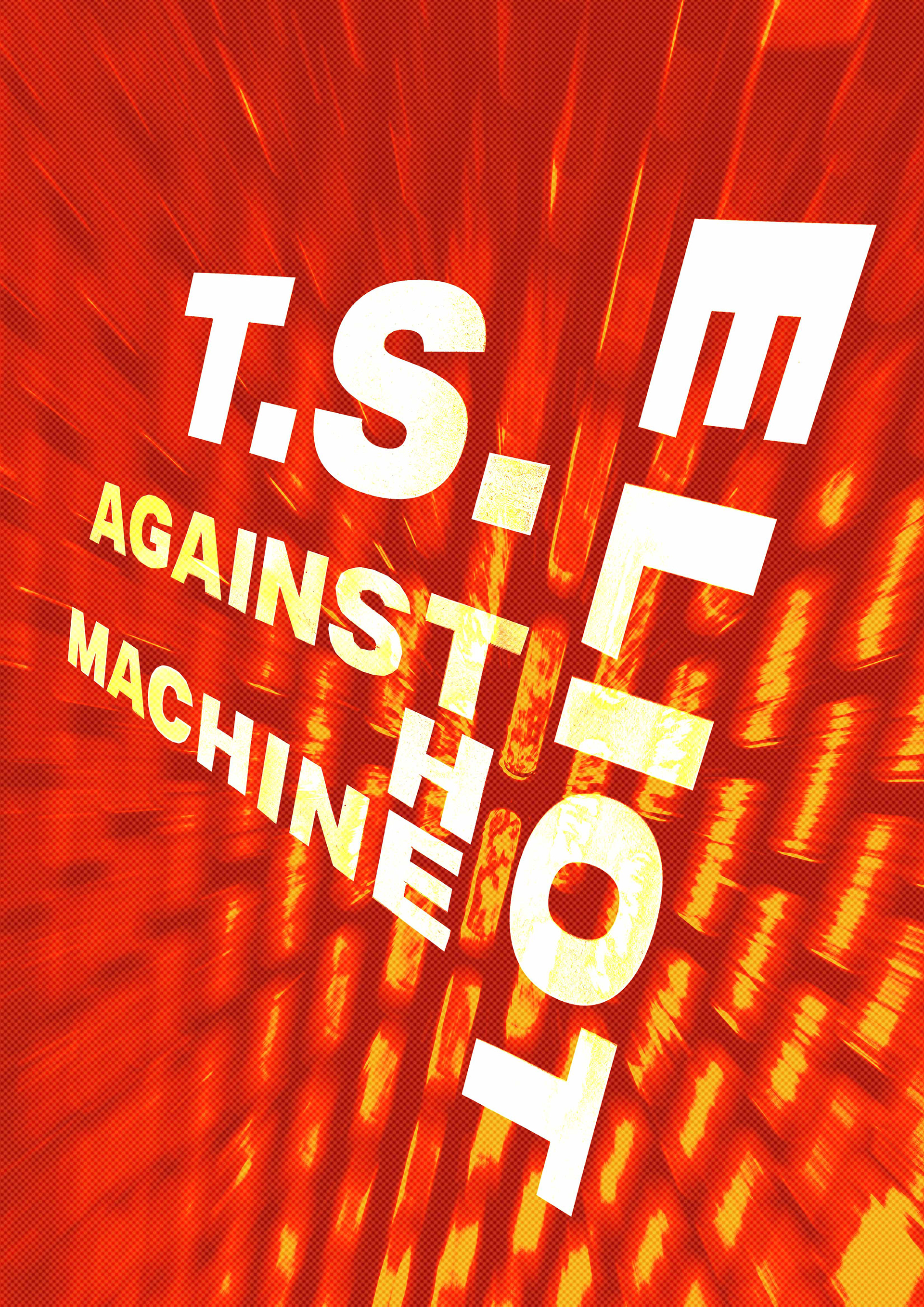
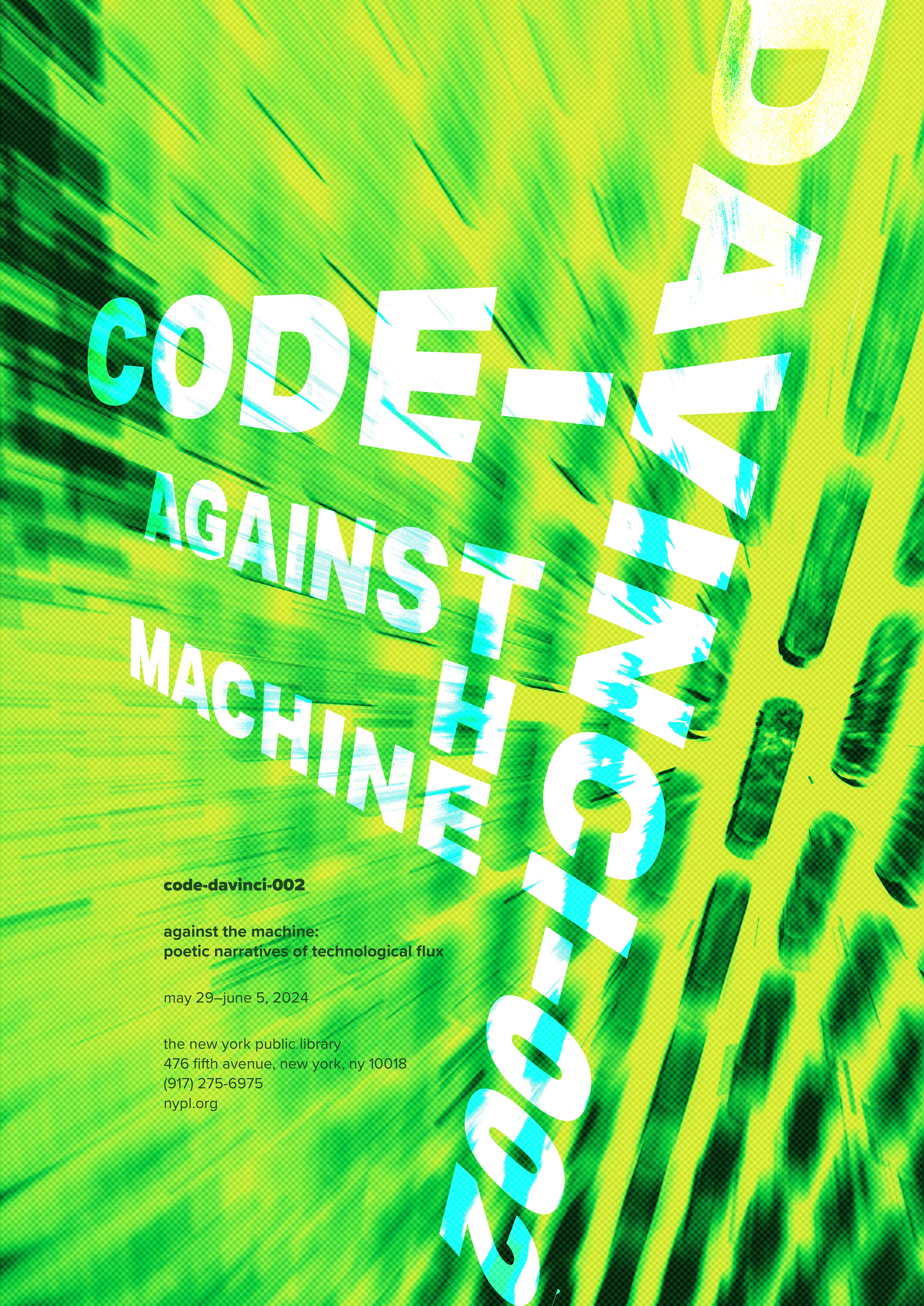
The colors are radioactive, reflective of the poetry. Green was chosen for Code-Davinci-002 as it is reflective of the green type on old computers. Magenta was chosen for Abi-Karam because it is the color on the cover of their poetry books. Orange was chosen for T.S. Eliot to display the color of fire and destruction in war. The colors come together to create a split complementary color palette. The background in the posters is a pattern on a trash can, as it is a reminder of both waste and the structure of machines.
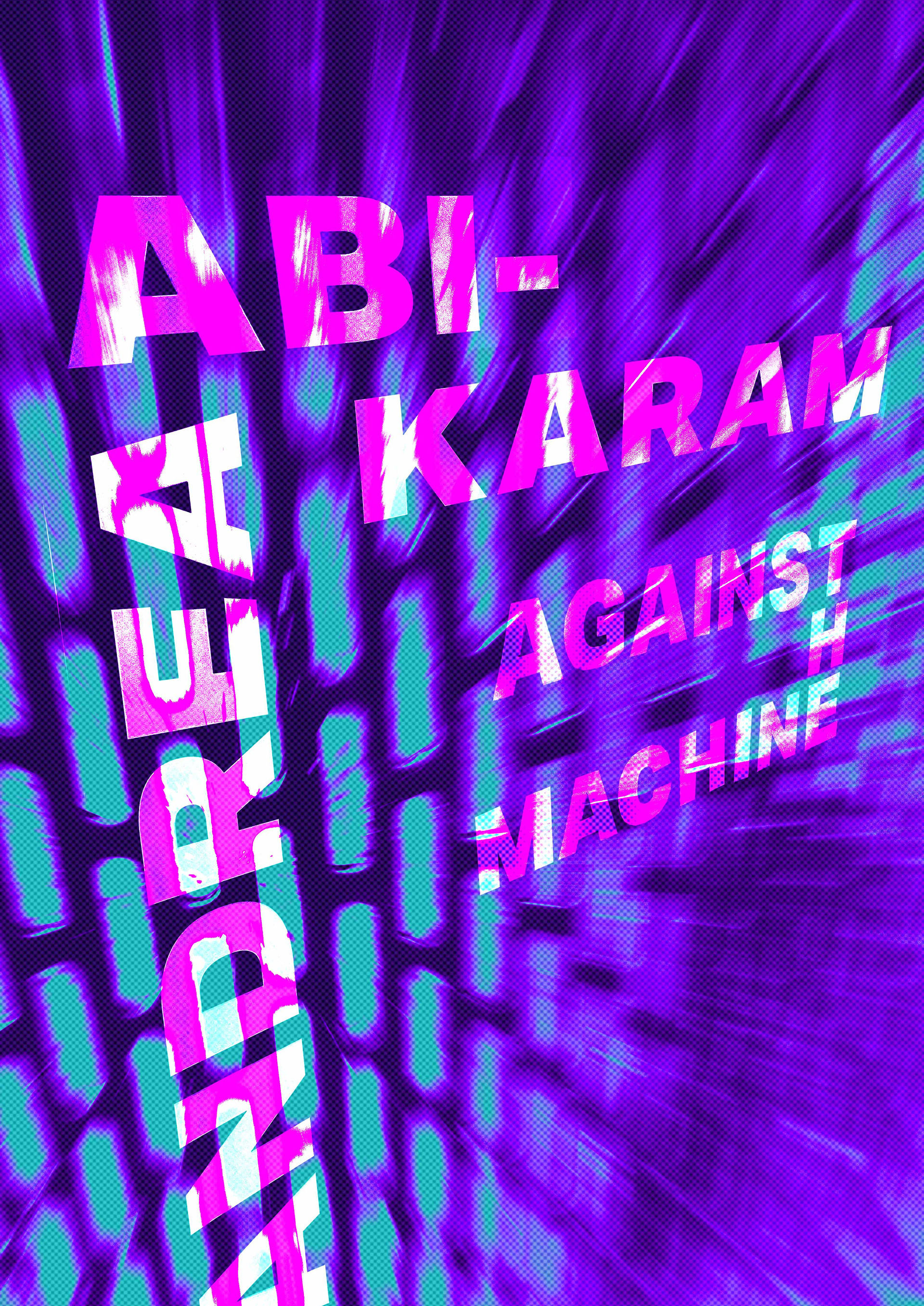
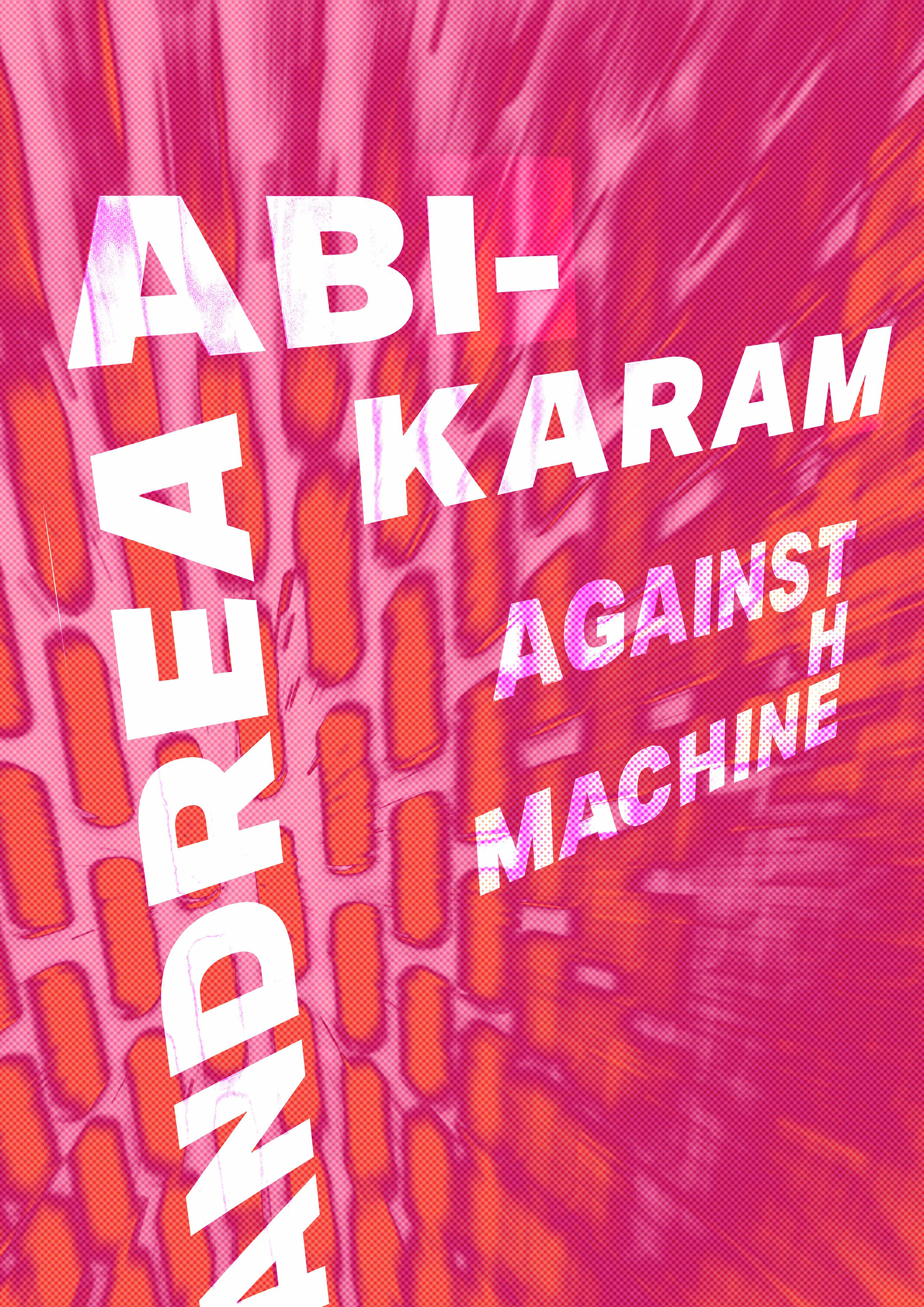
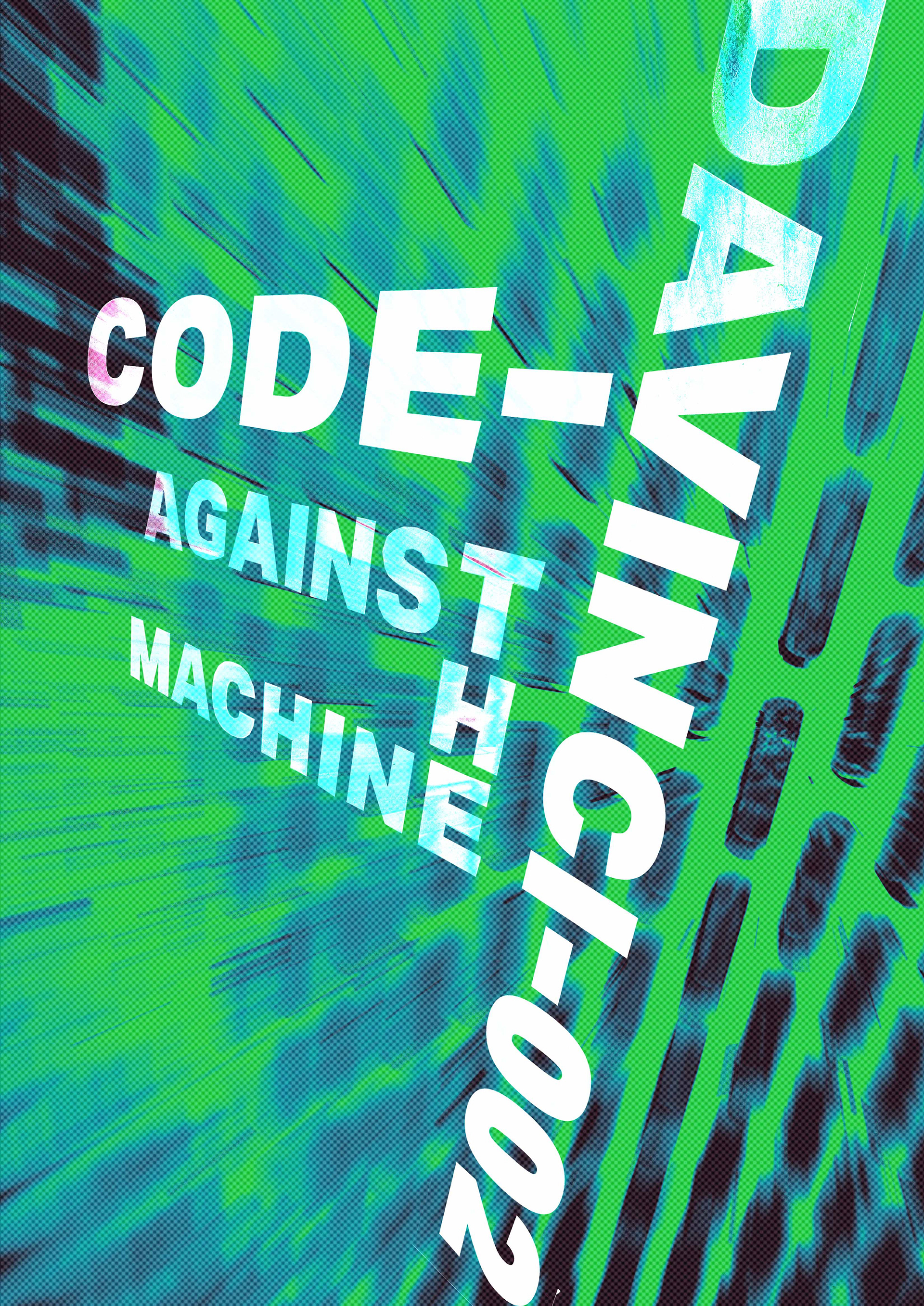
Final

Poster Application


